Paws Project : Doggy wellness centre in an agricultural barn conversion

Tom Hughes

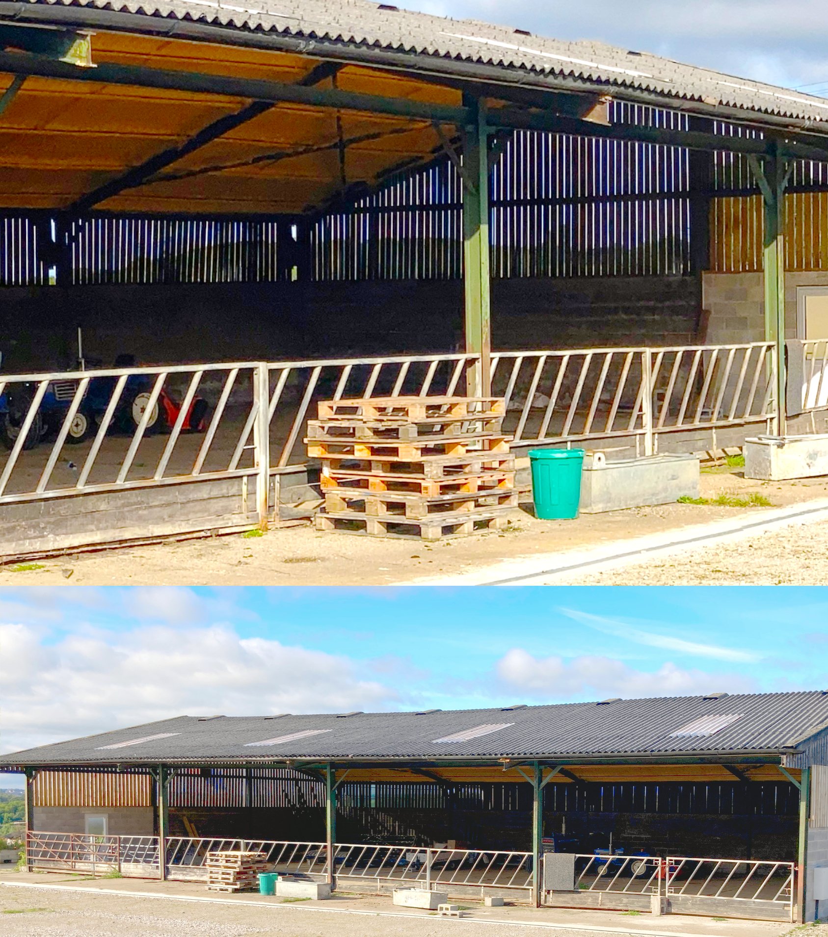
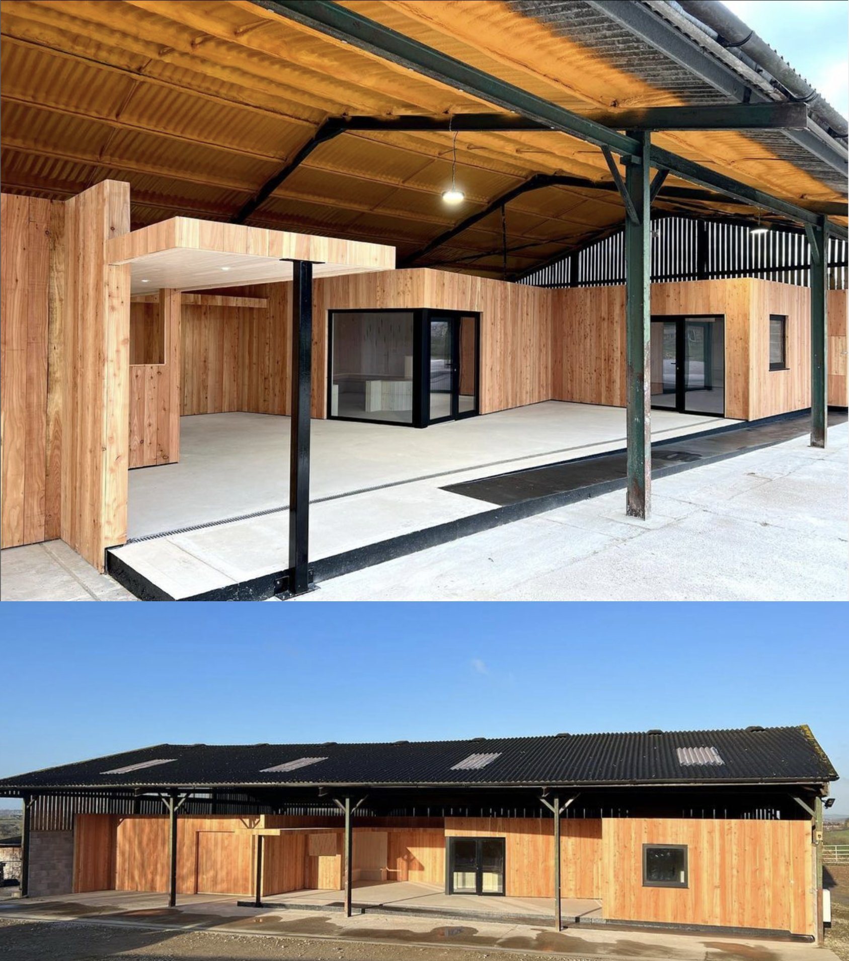
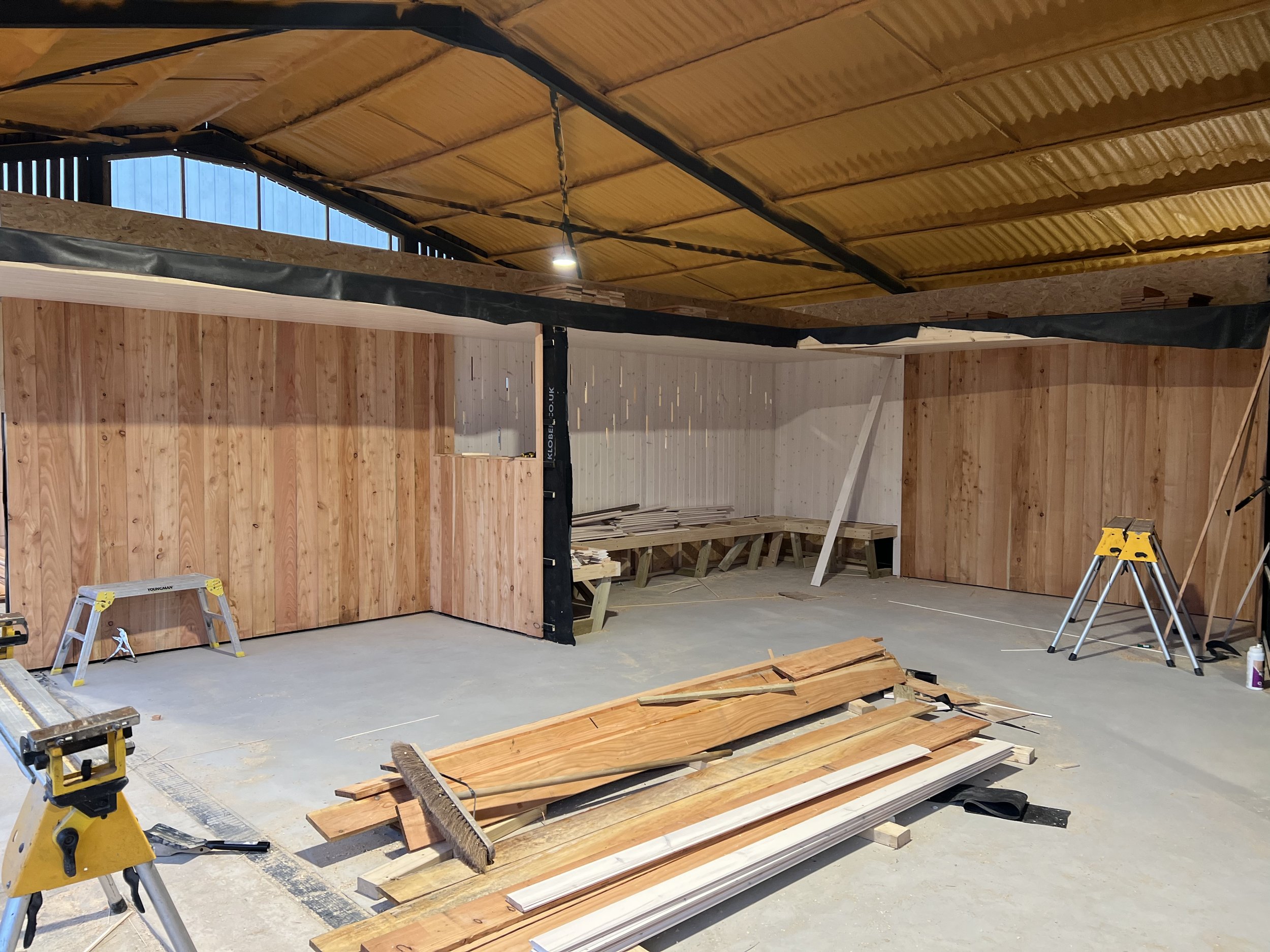
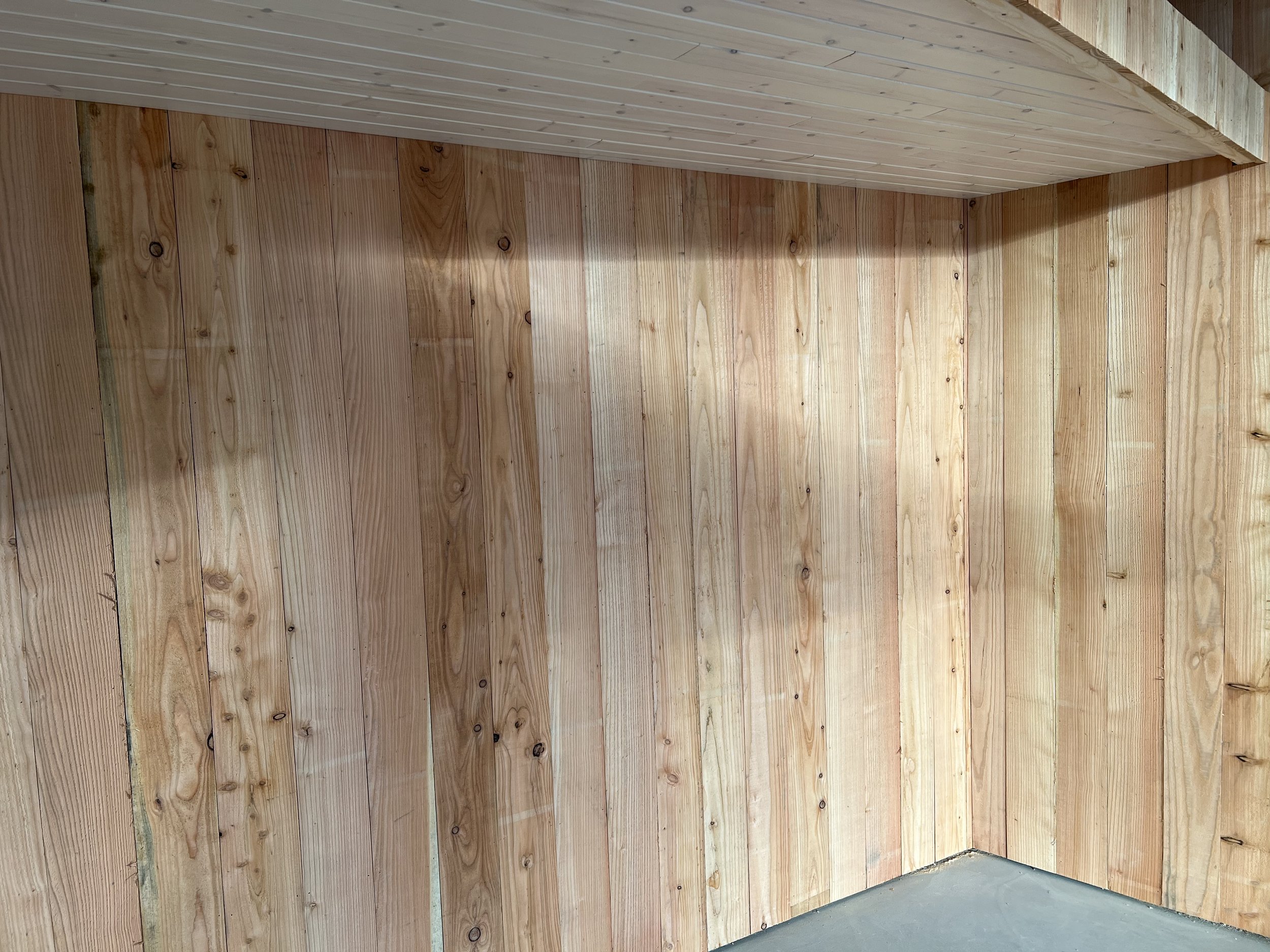
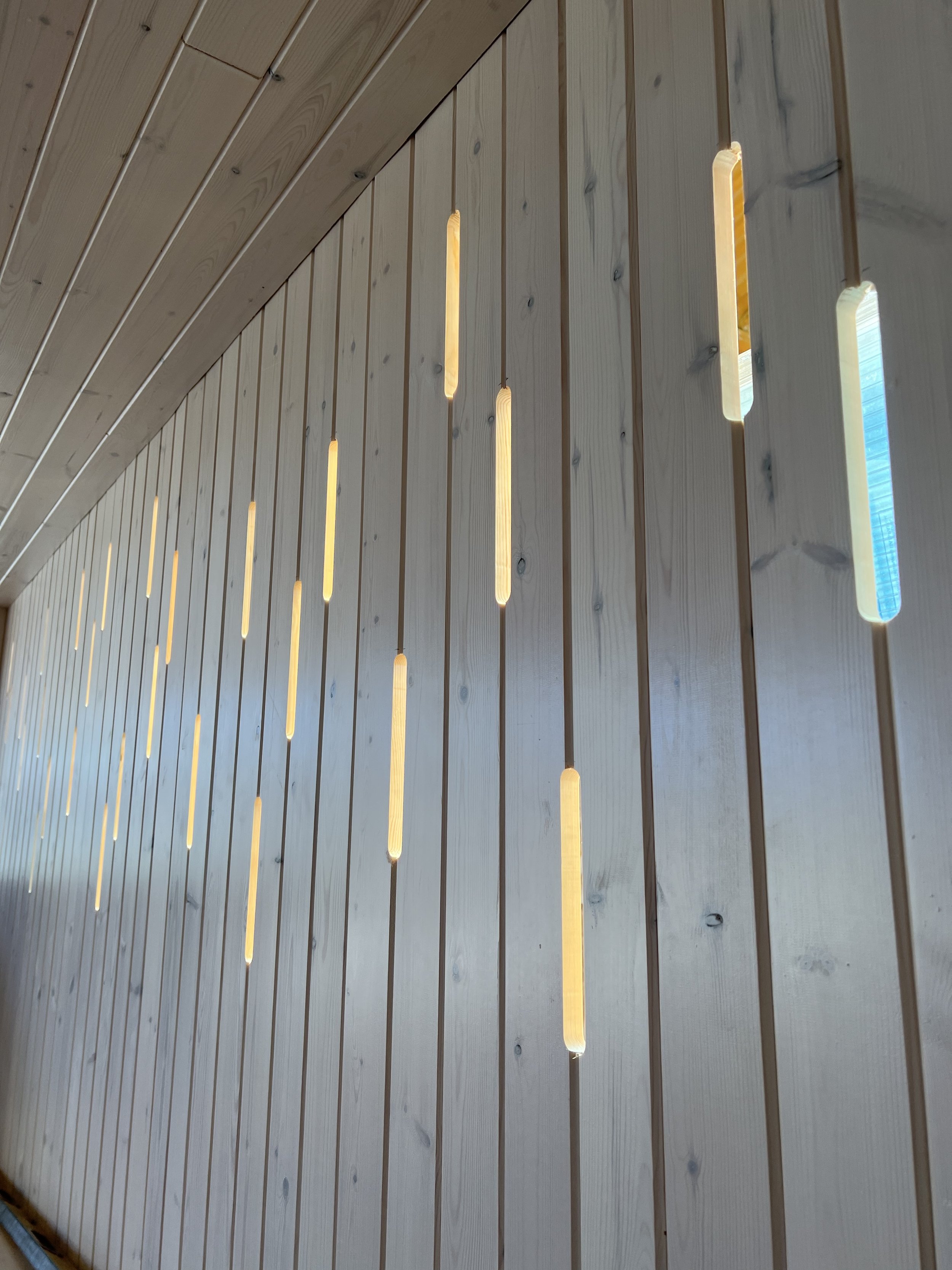
Our conversion of a former cow shed into a canine wellness centre for The Paw Project is complete.

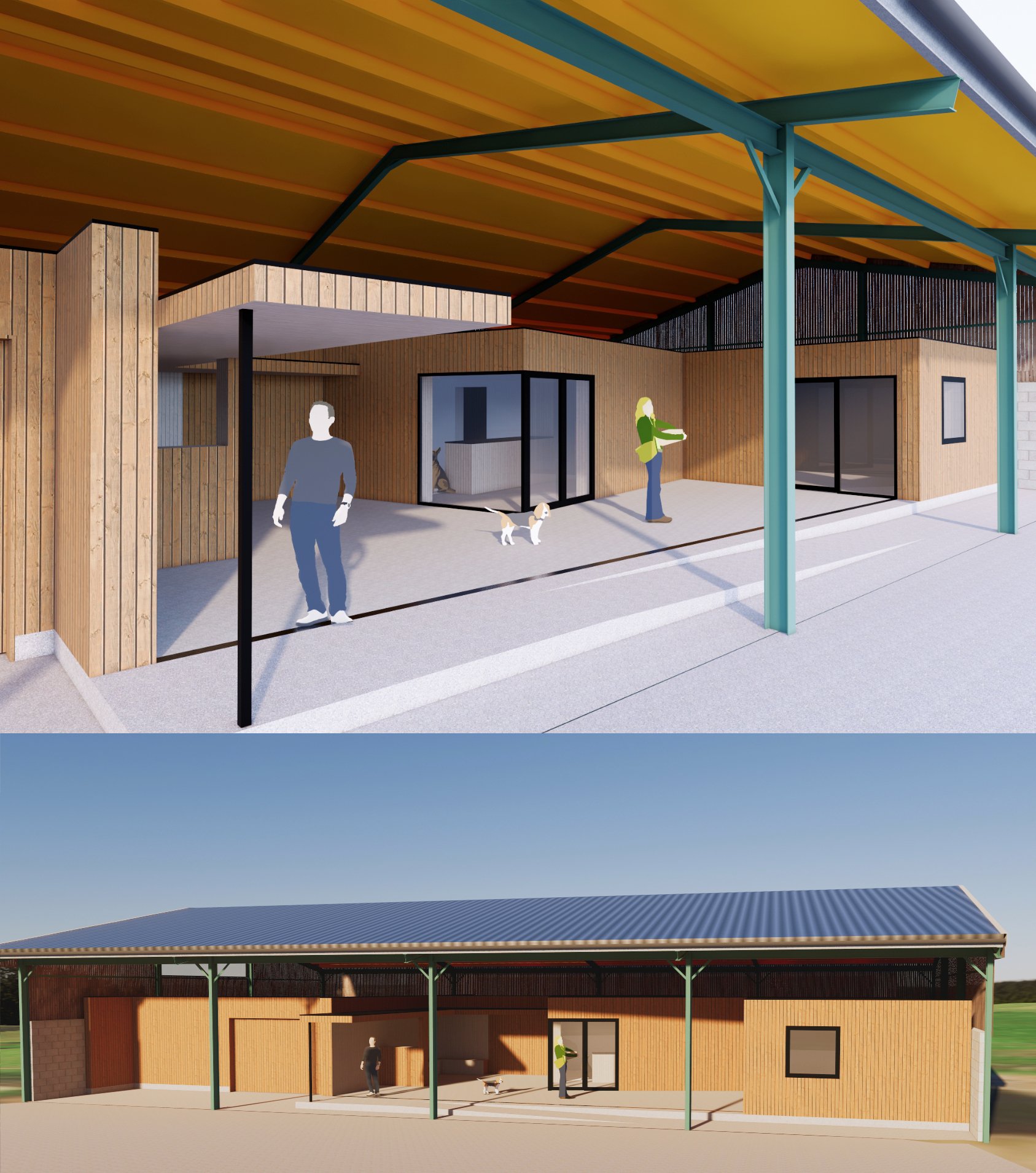
We opted to keep the new development low and spreading to create a welcoming outdoor sheltered space for owners and their dogs. This lack of formality reduces stress for the dogs, giving them space to mingle and to see where they are going.

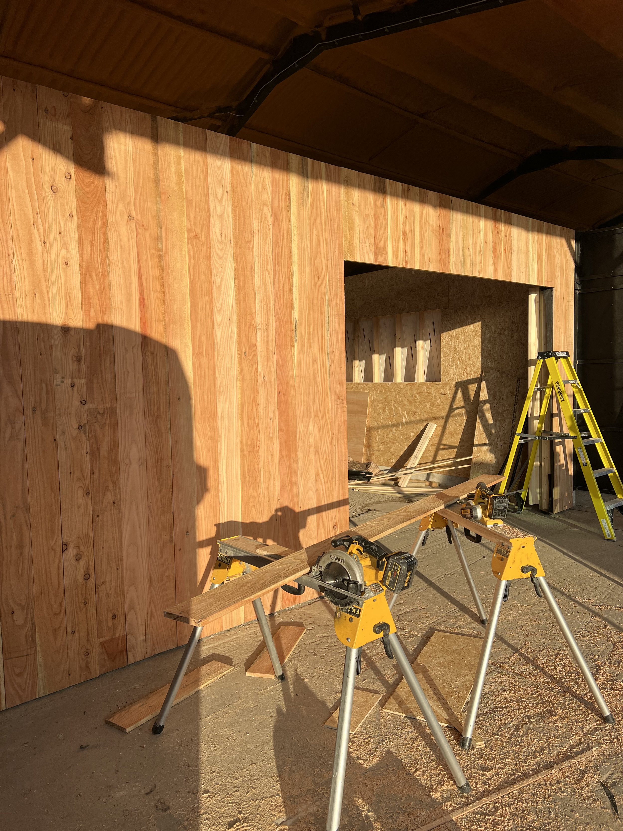
Two main enclosed spaces house an office and acupuncture studio, and a grooming and treatment area. An open barn-like space is hidden behind a sliding gate for use for agility and behavioural classes.

A seating area and sales point/event space are located under a protective canopy, creating an intimate scale under the soaring barn roof. These features, along with the enclosed spaces, screen the rear of the barn from view.

A phased development plan means that there is space to expand the facilities in the future, whilst presenting a complete environment to visitors in the short term.

Client: @the_pawproject Design & build contractor: Sheltered Spaces

Samba in the stair

Thibaut Devulder

Following our complete remodel and extension of their cabins in Hvitsten, overlooking the Oslo Fjord, our clients asked us to also fit an extra living space in one of the little annex buildings on the site.

Sections through the proposed tiny annex cabin, showing the “samba” stair to the sleeping space above

The tiny cabin that we designed accommodates a play space for the children during daytime, a small workstation, sleeping space for two adults and two children, as well as a small terrace for summer breakfast overlooking the fjord. To reach the private sleeping space tucked up over the small living-room, we custom-designed a compact alternating tread stair, called sambatrapp (“samba stair”) in Norwegian, which also doubled as a bookshelves for the desk underneath.

We love working on self-build projects and custom-made furniture, so we were thrilled when our client announced that he wanted to build the stair himself. As with our custom-made screen wall in the main cabin, we developed in collaboration with him alternative designs for the stairs, adjusting the design to joinery techniques he mastered, to produce a full cut-and-assembly manual to build the stairs.

Visit to the seaside cabin in Hvitsten

Thibaut Devulder

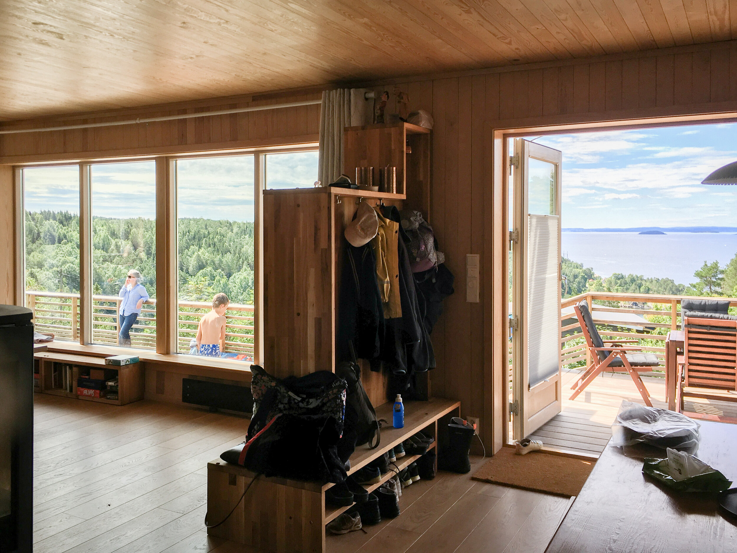
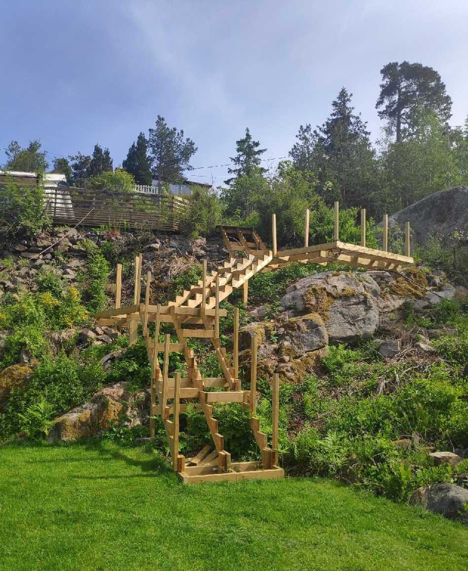
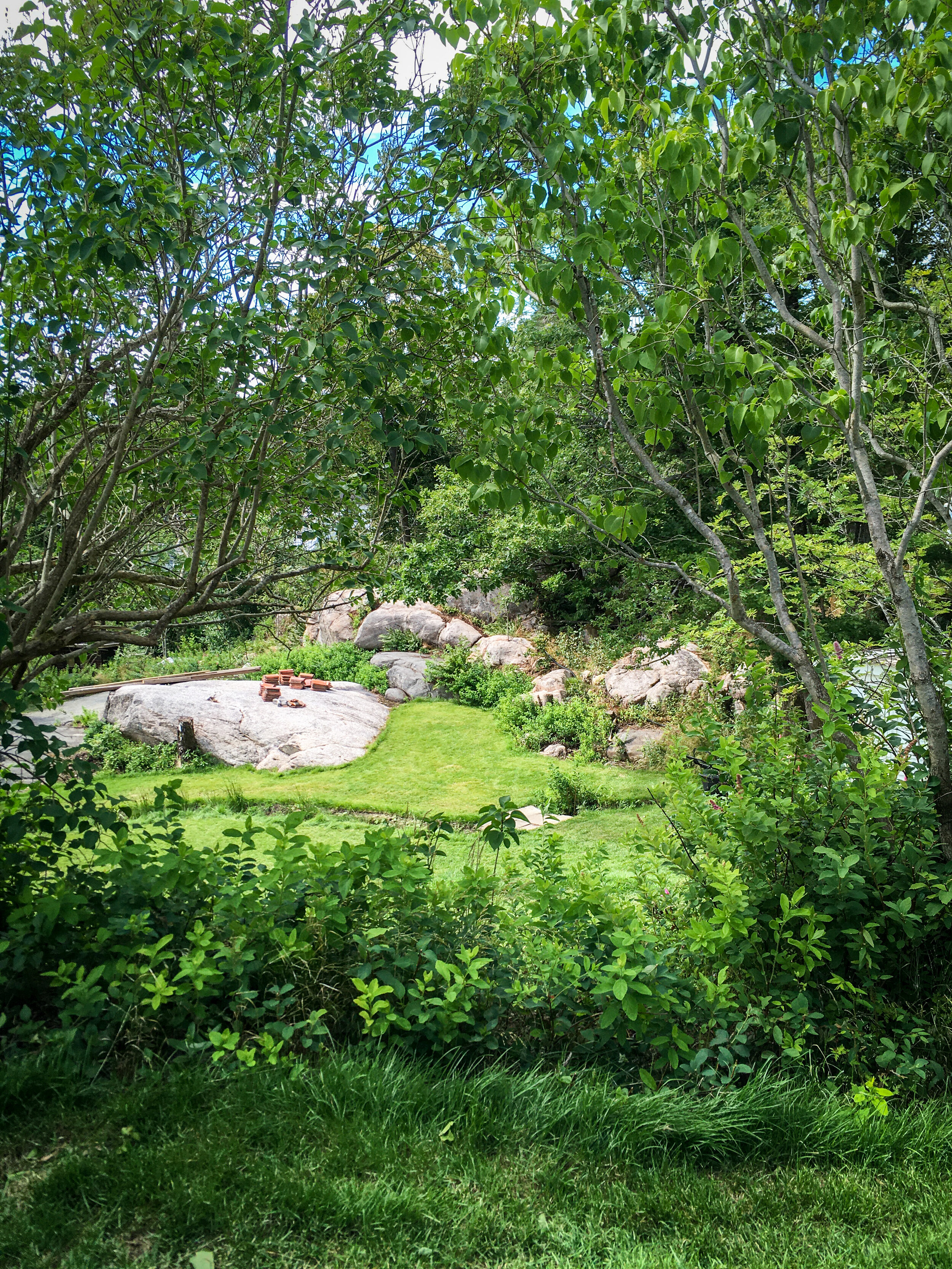
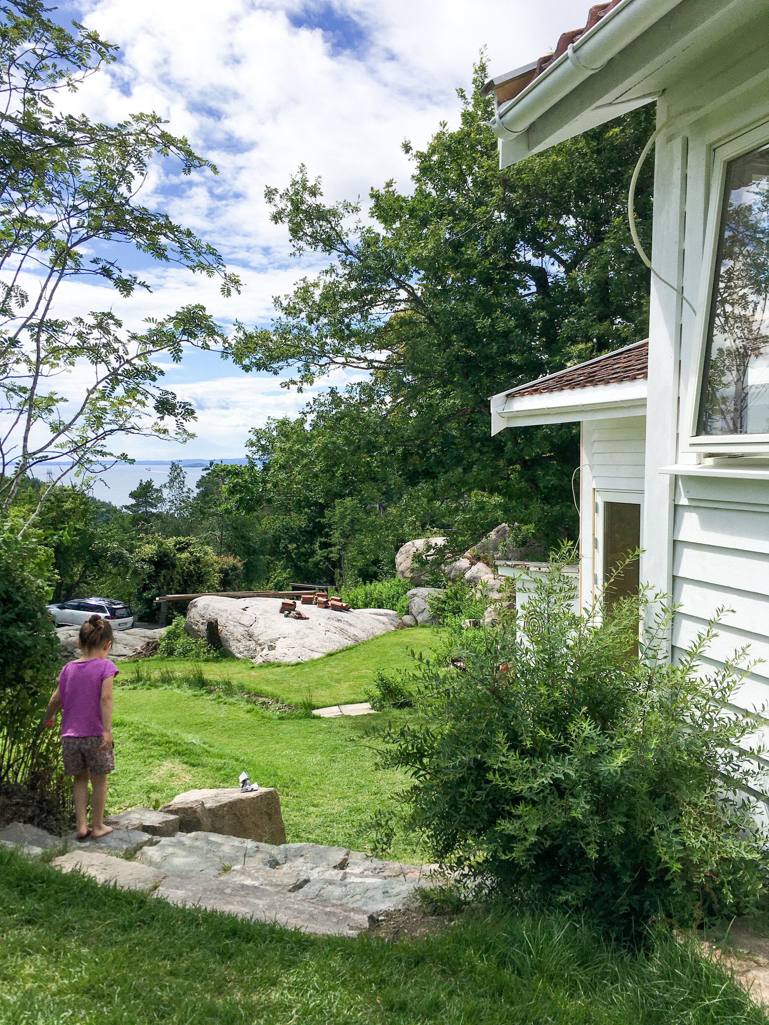
A visit to the summer cabin in Hvitsten we remodelled and extended a few years ago. The little annex cabin and terraced landscape that we have just finished designing are now in the process of being built. The landscaping on this steep site overlooking the Oslo Fjord is really bringing together the different indoor and outdoor spaces, happily used by three generations of families and friends!

Portfolio project
A log cabin in Sjusjøen

Thibaut Devulder

The south gables of the completed log cabins, on the snowy fields of Sjusjøen (Photos by Simon Stende)

For this project, we were tasked to design a new winter retreat on the snowy slopes of Sjusjøen, a popular cross-country skiing resort close to Lillehammer, Norway.

Our clients — a family of five — wanted to create a place to gather their extended family and friends for winter vacations and celebrations, accommodating up to three large families simultaneously — up to 16 people.

Unusually, when our clients approached us, they had already selected  a contractor to prefabricate and erect their future cabin, using the traditional log house technique. As they were not satisfied with their existing design solutions, they asked us to develop a custom design, tailored to their specific needs, which would also follow the contractor’s prefabricated construction method.

Our sketch plans of the cabin’s ground and upper floors

At the centre of our design, the large kitchen and the sunken fireplace lounge act as the two main gathering places, where guests can congregate around the main focal points of the cabin: the communal dining table and the large open fireplace. In contrast, each family enjoys its own private accommodation wing, branching off from these main spaces, with the sleeping quarters tucked away from the vibrant social rooms.

Between these two extremes, we intentionally convoluted the internal circulations to create gradients of privacy and strings of informal sitting spaces along them, where guests could interact throughout the day, but also giving opportunities for more quiet, private activities.

Each wing can be used independently, so that the effective size of the cabin can easily be adapted to the number of guests.

The exterior of the newly completed cabin, showing the use of the traditional materials and details of Norwegian log construction (Photo by Simon Stende)

While the interior of the cabin is intricate and spacious, its exterior maintains the compact aesthetics and typology of traditional log architecture — with its multiple interconnected volumes cascading down the sloped site, each visually expressing the different functions of the spaces they enclose.

Three distinct outdoor spaces are tucked around the wings of the building, anchoring further the cabin onto the site: the sheltered main entrance on the north side with access to ski storage, a sunny south courtyard linking the dining space to the open views, and a private terrace to the west, on which an outdoor bath can be enjoyed in the evening sun.

Our design served as the basis for the detailing and production of the hand-sawn logs that were produced and installed on site by the specialist contractor. The result is a very personal cabin, perfectly suited to the needs of its owners and embracing the tradition of Nordic log construction.

Would you like a cabin that really fits your needs and the nature around it?

In the snow

Thibaut Devulder

The Hvitsten cabin under construction, in the snow...

From the window niche in the play area, overlooking the snowy approach and the existing annex cabins

Hvitsten — a seaside resort on the Oslo fjord where we are redesigning a cabin — can still be pretty cold in winter. Yesterday's visit to the building site showed me an aspect of the project I hadn't experienced yet: the summer cabin in the snow.

Part of the client's brief was to make the cabin comfortable to use all year round, so I could finally put our design to test, overlooking the snowy landscape from its cosy interior.

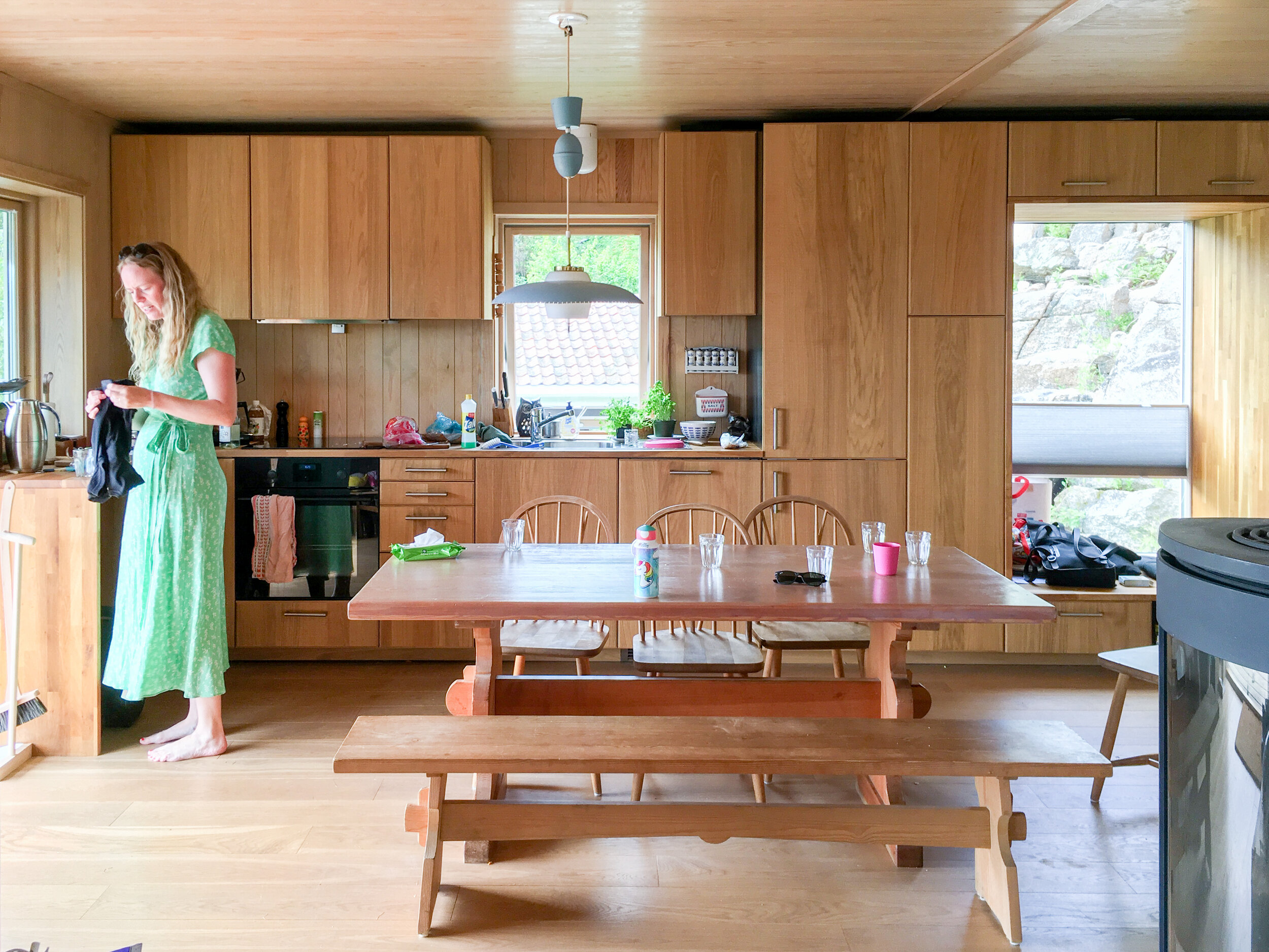
The interior is nearing completion and the new oak-clad storage wall was being installed, with its integrated kitchen and window niche in the play area.

The new kitchen and storage wall being installed

Construction work started in summer cabin

Thibaut Devulder

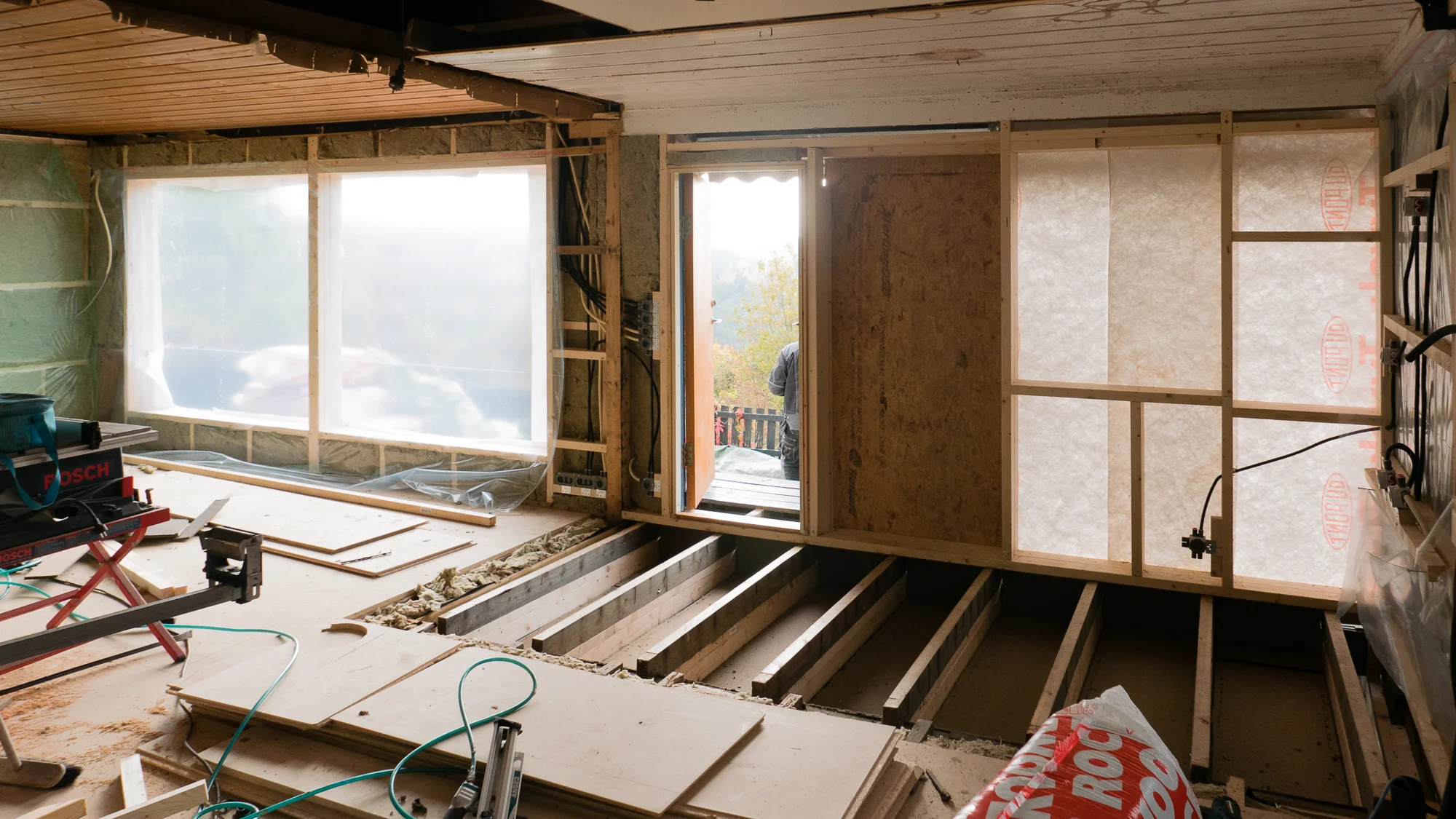
First site visit to our seaside cabin redesign project in Hvitsten, where construction work started a few weeks ago. The new interior spaces are starting to take shape...

Portfolio project
A seaside cabin in Hvitsten

Thibaut Devulder

Sketch impression of the remodeled cabin, looking at the fjord from the playroom

We love to design cabins, as they bring together so many of our design interests.

First, our predilection for architecture in remote (and often sensitive) natural locations, to create small thresholds where man meets nature, where minimal environmental footprint and limited access call for an economy of means.

And we are fond of designing tiny spaces — creating places rich in human interactions and intricate functions where people can really "key in" with the architecture, bringing back the simple joy of being together, sheltered from the elements.

But as importantly, cabins also act as social nodes where the complex community of the different generations in a family or in a group of friends congregate, each with their different needs, expectations and desires, making for a challenging but fascinating briefing process.

This redesign of a seaside cabin in Hvitsten, on the shore of the Oslo fjord, brought all these aspects together and was a nice counterpoint to our earlier design of a skiing winter cabin in the mountains of Hedmark.

A small stream flowing between the existing cabins

About the project

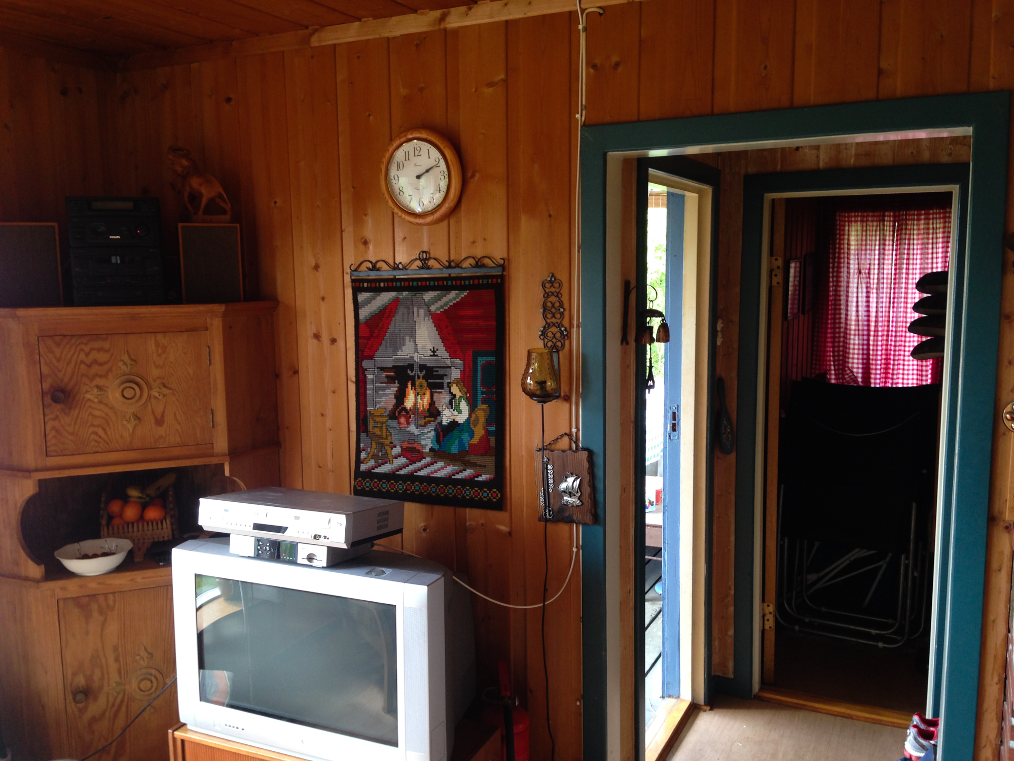
As is often the case with Norwegian cabins, our clients for this project spanned over three generations. Initially built in the 1950s by the great-grandfather, the summer cabin and its small sleeping annex have been used ever since by the family for spring and summer holidays.

The extended families are now struggling to all fit in the cabins, which has become both too small and in need of repair. Now retired, the grandfather and his partner also want to use the cabin a lot more throughout the year, so they needed the uninsulated cabin to be upgraded for the winter climate and wished to have a real bathroom installed.

All had cherished childhood memories of the cabin and wanted to preserve as much of its exterior aspect and rustic character as possible. So, their requirement to comfortably fit in up to twelve sleeping guests for occasional extended family gatherings called for inventive remodelling and renovation, considering their tight budget!

Looking at the existing cabins

Perched against a steep rocky hillside overlooking the sea, the cabins face south-west into a breathtaking view of the Oslo fjord and its slow ballet of sailboats and cruise ships.

The Oslo fjord, as seen from the main cabin

Plans of the existing cabins

In the main cabin, the small living room actually had a large window opening towards the fjord, but the kitchen and meal area — central to family life in the cabin — were situated behind it, in the darkest part of space of cabin, right against the rock face to the north. The other facades of the cabin were essentially blind because of a small hallway and the two bedrooms to the west. As a result, the main daytime social spaces had no visual connection with either the covered porch to the south-west or the sleeping cabin to the west, both of them often used in the mornings and evenings for informal meals and drinks.

Typical of spaces with light coming from only one direction, this configuration made the living room and meal area appear strangely gloomy, as the large window created a glare effect in contrast with the other darker and unlit interior surfaces. Built to look straight onto the fjord through this large window, the space had only short interior perspectives, making it appear more cramped and small than it actually was.

Situated a few meters downhill and to the west, the sleeping annex had a quiet simplicity to it, nested in the overgrown vegetation and straddling a small stream in the rocks. Unfortunately, an improvised shower had been installed inside a few years back without proper ventilation and created damp problems, so that in addition to being overcrowded, its sleeping rooms had also become uncomfortable.

Welcoming everyone

The initial plan was to integrate the existing porch into the main cabin, to create an extra bedroom. While this made sense to accommodate more guests, we all agreed that this compounded some of the existing problems, in particular closing off the main cabin from the fjord.

From two to fourteen sleeping guests! (click for full size) 

Turning the problem around, we actually removed one bedroom from the main cabin, thus keeping only one for the most frequent occupants of the cabin: the grand-father and his partner.

We carefully checked the feasibility of our proposal by preparing a comprehensive list of use scenarios, from one couple to up to fourteen sleeping guests! We found that moving the shower out of the sleeping annex, ventilating it properly and making some slight adjustments to its interior layout and bedding would allow eight people to comfortably sleep there. All this could be done at minimum cost, so that most of the available budget could be dedicated to the main cabin.

Now remained the task of optimising the shared daytime spaces in the main cabin. And this was essential: every parent can imagine the intense atmosphere when up to three families, including young children, are stuck together indoors for a whole rainy afternoon! Thus, in addition to creating functional living quarters, we also needed to organise sub-spaces within this small cabin, so that everyone could define his or her comfortable own space.

A niche in the rocks

We approached this task from two different angles.

Our design strategy for the remodelling the main cabin, drawn over the plan of the existing cabin (click for full size).

First, we created two different sub-spaces: one for the adults, facing the fjord, more social and relaxing, and one more playful for the children, cradled against the vegetation of the shaded cliff face. These two spaces intersect around the dinner table, the natural converging point for the whole family.

Then, we connected these spaces to the outdoors by nesting these sub-spaces around generous openings — not just towards the fjord, but also towards the sleeping cabin wrapped in overgrown vegetation down to the west, the mossy rocks at the north and the sunbathed terrace to the south — to create a dual feeling of spaciousness and enclosure.

Sketch impression of the remodeled seaside cabin, looking across the living room

Although the main living space remains compact, it feels opened to the light patterns and textures of its natural surroundings.

Frequently eating out during the summer months, the kitchen and dining area extend out onto a terrace that is stepping down, so as to maintain unobstructed views of the sea horizon, even when terrace parasols are used or the large awning on the south facade is deployed. The terrace also acts as a connecting point between the main cabin, the play garden and the shaded path to the sleeping cabin.

The proposed plan for the main cabin (click for full size)

Fitting it all together

Space was very limited inside the main cabin, so we concentrated most of the storage along the west wall, designed as a large oak surface perforated by the kitchen and large window niche where children can sit and play. To make sure that everything fitting nicely, we produced a detailed specification for these densely fitted interior — both in Norwegian and in English, at the clients' request.

We love to involve our clients in the building process. And since one of them is keen on woodworking, we had a design session together to develop together the design of open screen between kitchen and sitting, which also will also integrate coat/shoe storage, seating, a book shelf and the TV equipment. He will later on build it himself.

The very basic existing drainage and electric systems were upgraded to cater for the new bathroom and appliances. The cladding was damaged and needed replacing, so we insulated the whole building fabric and fitted new energy-efficient windows. Along with a flexible shading system and ample provisions for natural ventilation, our clients will be able to enjoy their cabin all-year round!


Portfolio project
A skiing cabin on Sjusjøen

Thibaut Devulder

Entrance of the existing cabin

Planning permission has been granted to our project on the stunning settings of Sjusjøen, north of Lillehammer, Norway.

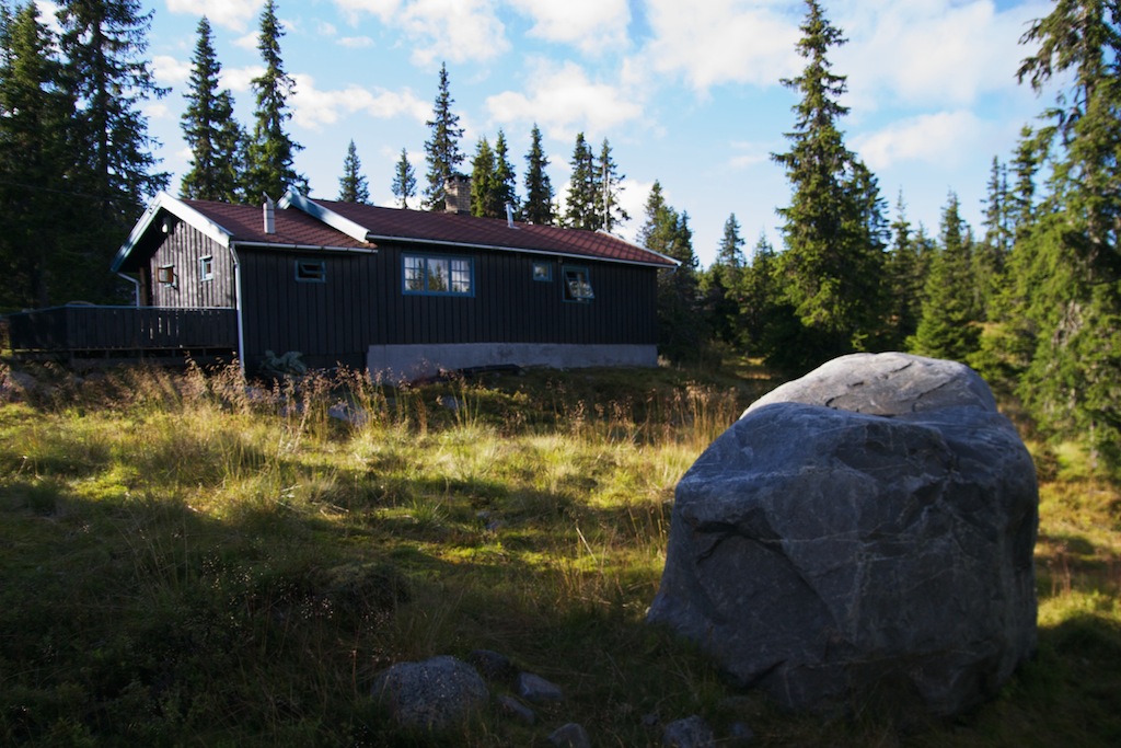
Overlooking the well-known Norwegian cross-country ski resort, this small mountain cabin, built in the late 1960s by the client's parents, had become too small for her extended family. The client wanted to remodel and extend it to accommodate family gatherings. With no running water in the kitchen and only two sleeping spaces, the cabin also lacked sufficient indoor storage to accommodate more than two guests.

Emotionally attached to the cabin, the client wanted our intervention to address these issues, yet preserve the modest scale of the building, as well as most of its interior and exterior finishes and furniture — some of them hand-made by her father.

We tackled the challenge by extending the cabin towards the west. Shifting the entrance to the other side of the cabin greatly simplified winter access, avoiding snow drifts from the roof and reaching out closer to the car parking space. More importantly, this allowed us to create a central spine running through the extension.

Linking together the extension and the existing cabin, this spine accommodates extensive storage spaces serving the master and guest bedrooms, where luggage can be droppped on arrival without cluttering the living rooms.

Clad in timber slats, contrasting with the other materials of the cabin, the spine acts a functional and visual link between old and new, sheltering the sleeping quarters from the common spaces.

At the end of the spine, minimal reorganisation of internal partitions allowed for a compact and comfortable kitchen and bathroom, with minimum alterations to the existing plumbing.

The wind lobby and storage were moved from the original access to the new entrance, with the addition of a ski preparation room. In their place, a new living room was modelled into the existing building fabric — opening up the cabin to the fantastic views to the wild marsh on the east and the sun's warmth to the south.

Externally, the extension matches the scale and appearance of the existing cabin. The two bodies however are connected by a section with a lower roof and cladding matching the sheltering slats of the existing entrance, clearly identifying the new from the old.

Inside, most of the floor and wall finishes of the existing wing are preserved. The new spaces, to the west and south, however, contrast with their sloped ceiling and stained boarding.