Møllenberg: Urban gardening in Trondheim

Thibaut Devulder
Visualisation of urban farming over a historical picture of Møllenberg, in Trondheim, Norway

Our photomontage for the cover of the competition entry

We have just collaborated with Ur Arkitekter on a prequalification entry for the masterplanning competition of the Møllenberg neighbourhood in Trondheim, Norway..

Rethinking the identity and social dynamics of this historical neighbourhood in the centre of Trondheim — today mostly populated by students — our concept proposal explores how communal urban farming can be used as a catalyst to foster social diversity and renew community engagement in the city.

Riddle: a sculpture from waste plastic

Thibaut Devulder

Future Makers is a Nottingham-based creative studio who has been spending the last five years researching the potential of waste plastic, bringing together the local community, design creatives and artists to create innovative artwork and products.

Having recently acquired a whole set of waste plastic recycling and manufacturing equipment (which we have already started experimenting with), they announced an open call for a lead artist to craft an outdoor public artwork in front of their building, using one tonne of locally-sourced plastic waste.

The street facade of the existing Waste Plastic Studio (photo © Future Makers)


Our proposal

Continuing our exploration of community-built urban interventions in Nottingham, we responded to this open call with a diaphanous facade sculpture, to transform the Future Makers' building itself into a large art piece, and create a visually striking and intriguing street presence that hovers over the public space.

Questioning the ubiquitous nature of plastics in today's built environment and consumer society, the sculpture takes the form of a diaphanous mesh appearing to deform in and out of the building facades, to exude from the fabric of the building itself: the manifestation of the presence of plastics in a new, recycled form — and its metamorphosis from undesirable waste to creative potential. This large undulating sculptural mesh creates a unified identity across the site, linking the public space, the building entrance and the large industrial shed at the back.


How we use recycled plastic

Despite its visual complexity, the mesh of the sculpture is created entirely out of identical recycled plastic modules, assembled in a repeating reciprocal pattern. The mesh derives its three-dimensional shape from the pattern of assembly of these modular components, linked together with a simple zip-tie-like "cilium" component.

Building the sculpture

The form of the sculpture emerges not from the complexity of its components, but from the assembly process itself: simply varying the pattern of assembly along the mesh allows shear, deformation and stiffening of the surface into a complex shape that symbolically intersects with the building's facades.

Assembling the sculpture is deceptively simple and can happen almost entirely on the ground, before being attached to the facades. The assembly and erection of the different sections of the sculpture will be carried out during community workshops involving neighbours, local schools and fellow artists, creating a sense of ownership while introducing a large audience to the potential of recycled plastics as a creative material, through practical, hands-on workshops.

Examples of alternative assembly patterns for the modules that can be combined to create different levels of curvature and stiffness, and achieve the desired three-dimensional mesh form


Continuing our journey

Since its inception, 2hD has explored the relationship between architecture, visual arts and community engagement, through a series of successful international art projects ranging from architectural pavilions to collective sculptural work, interactive installations, scenography and audio-visual performances.

The common thread through all these different projects is our personal research into architectural elements as a receptacle for our own stories, emotions and daydreams, introducing a fractional dimension to surfaces to invite this projection — and exploring how, in turn, it affects how we perceive and inhabit the spaces they define.

This proposal also keys in with our love for reusing ubiquitous and repurposed materials: transformed cardboard boxes for collective community sculptures in The Lost Cuckoo, recycled plastic tubing to introduce school children and architecture students to complex geometries during hands-on teaching sessions, and natural fiber broom heads to clad an entire building for our Mission Control micro-office.


Portfolio project
A birdwatching 'eyrie' to hover over Wicken Fen

Tom Hughes

We recently achieved Planning Permission for a new birdwatching hide and observation deck for the National Trust at Wicken Fen, Cambridgeshire.

Set at the edge of the fen, the structure was inspired by the singular setting of the SSSI site. The fully accessible birdwatching hide is nestled like a cocoon inside a screen of undulating timber battens. The observation deck above gives view over Sedge Fen, roosting site for Marsh and Hen Harriers. A final eyrie-like observation level gives 360° views ,which take in the whole of Wicken Fen nature reserve and the big skies for which it is famed.

The building nestles into the Carr (tree scrub) at the edge of the Fen.

The highly sensitive eco system of the site is based on 3 meters depth of peat soil, so the structure is designed in collaboration with Canham Consulting Engineers to “touch the earth lightly”, elevated above the Fen on piles so that the habitat can flow underneath. A gently ramped boardwalk, designed for wheelchair accessibility, connects the hide to the existing boardwalk footpath some 30m away.

A fully accessible bird hide at the entry level floats 1.5m above the fen, upper levels can be explored via a triangular staircase to the rear.

Wicken Fen is the National Trust’s oldest nature reserves and one of the most important wetlands in Europe, supporting over 9000 species including a spectacular array of plants, birds and insects. 2hD won the commission via a competitive interview in partnership with Sheltered Spaces, with whom we went on to design the timber cladding and the public consultation process. It is a great privilege to be entrusted with such a sensitive site and to be supported by a client keen to think afresh about how visitors might experience and understand the Fen’s sense of place.

Project team:

Timber screen experiments with Marcus of Sheltered Spaces

Portfolio project
Squint: a micro-exhibition module

Thibaut Devulder

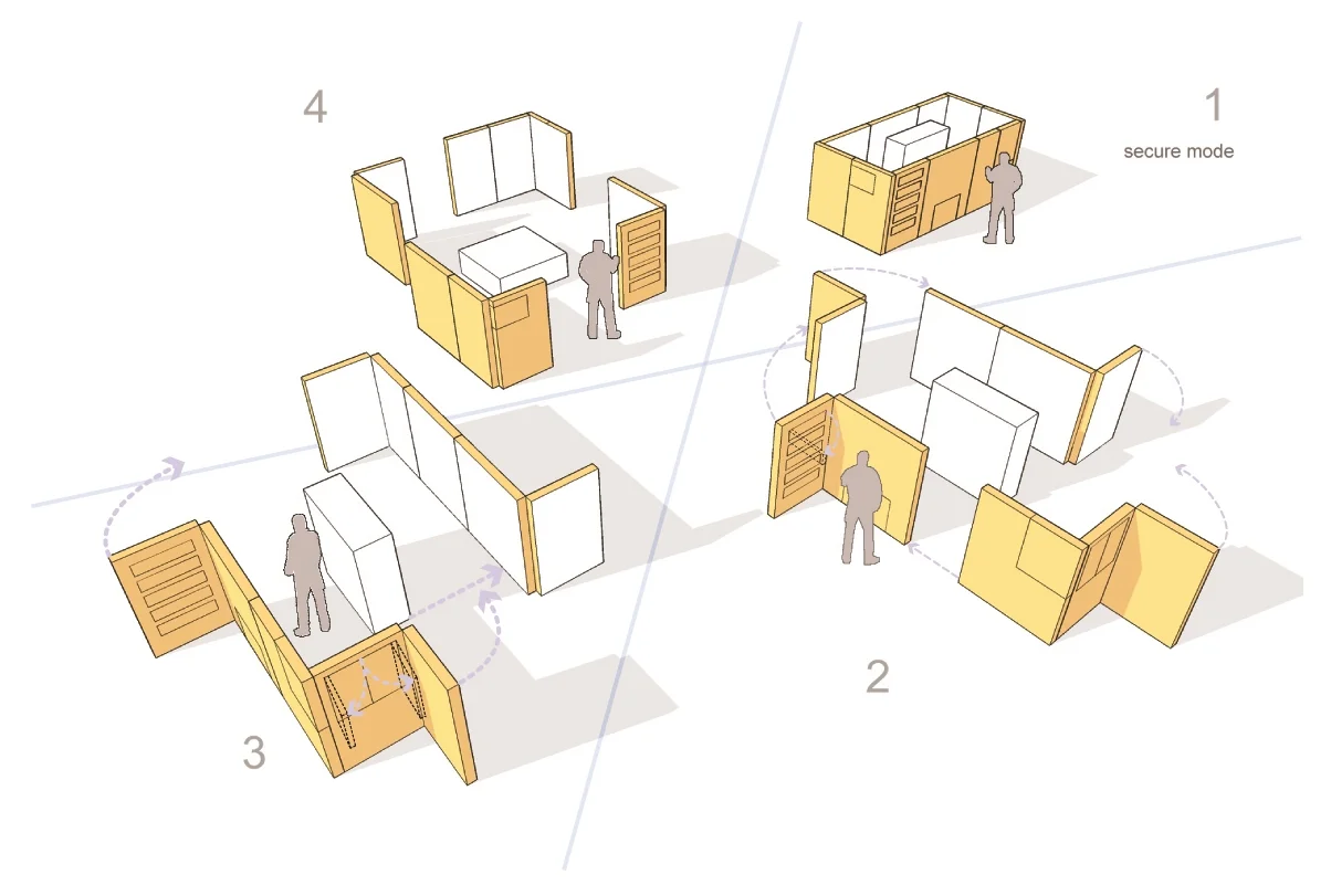
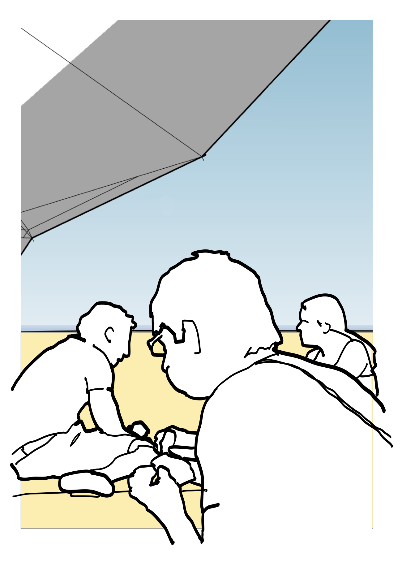
Mining some of our old files recently, we dug up this little gem from 2006: a mobile exhibition module we called Squint. It's an installation we originally designed for a competition in Calgary, for the temporary transformation of an urban space situated under a railway bridge.

Squint in the streets of Calgary (from our competition entry in 2006)

Excited by the idea of the self-building something we would then send to the other side of the world, we took the approach of a foldable crate system that could be deployed in an unlimited number of configurations, playfully modulating the openness — or enclosure — of the micro exhibition space it hosted.

Set on its site and then manipulated by the public, the articulated and perforated little structure offered glimpses of its content to passers-by, "leaking" some of its content to the surrounding urban space.

In another context: Nottingham's Exchange Arcade...

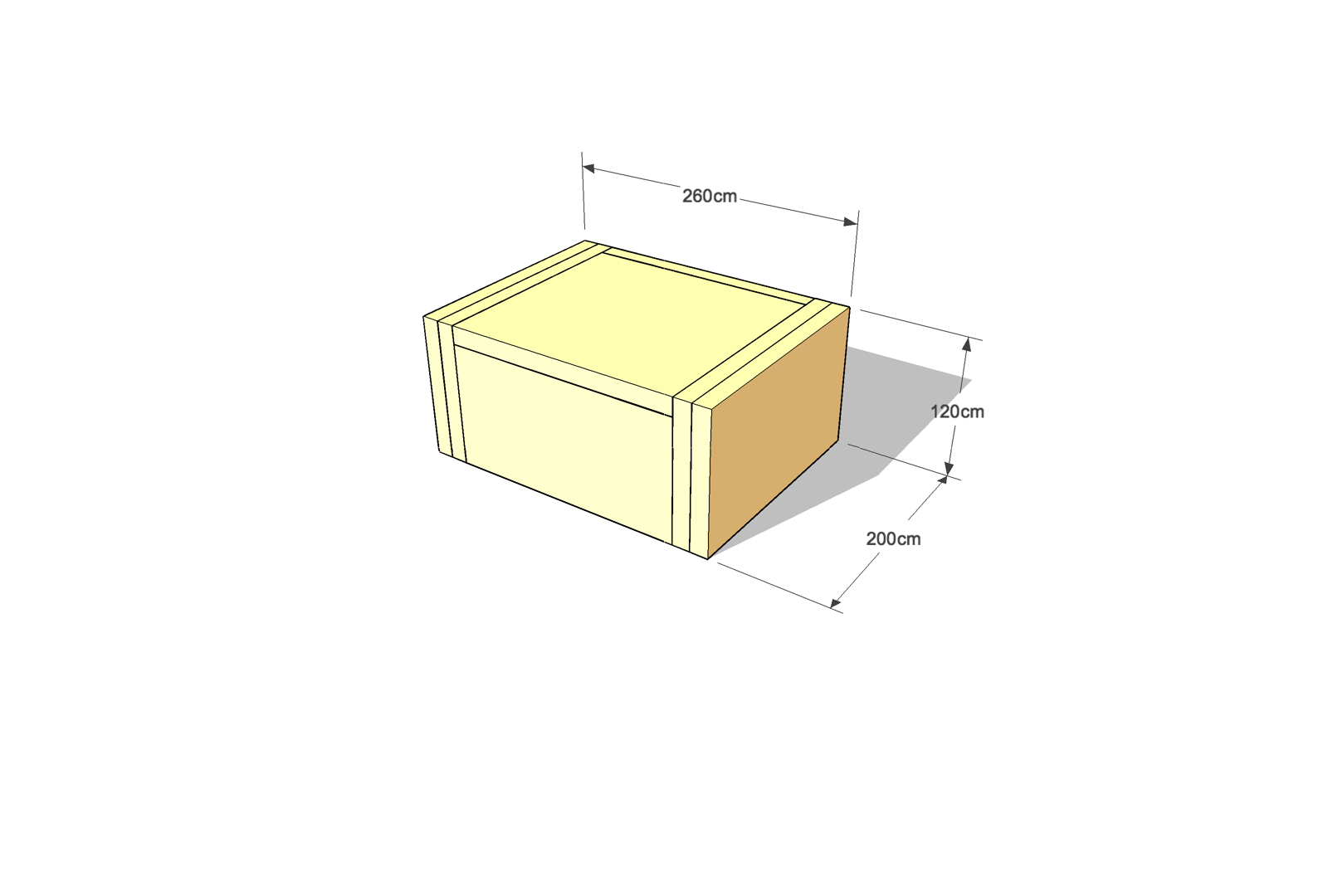
And of course, for easy transportation, the whole thing can be neatly folded into a tiny, self-contained crate containing both the panels and the exhibition materials, ready for shipping!

This was a fun little project and maybe something to prototype again?
Interested? Get in touch with us!

Prequals for the redesign of Tungestølen

Thibaut Devulder

We have just sent in a prequalification entry for the reconstruction of the Tungestølen turisthytte. This mountain refuge stood at the foot of Jostedalsbreen — Europe's largest glacier for a hundred years until destroyed by the Dagmar storm in 2011.

We have teamed up (once more) with Norwegian architect Brit Sejersted Bødtker to create our vision and practice presentation for the jury. Five teams of architects should be shortlisted sometime next month to start the design competition. We would love to be on that list!

The prequalification application had to be very concise (two A4 pages), explaining what we would bring to the project. You can view our application below (in Norwegian), with an extract translated into English underneath...

Jostedalsbreen glacier (Photo: Alberto Abouganem Stephens)

Jostedalsbreen glacier (Photo: Alberto Abouganem Stephens)

Click image to view the original prequalification application (in Norwegian)

Click image to view the original prequalification application (in Norwegian)


Our vision for Tungestølen

We imagine Tungestølen as the intersection of two eroding forces.

One force, exterior, created by the natural elements in all their rawness and their monumental scale, shaping this man-made shelter. As the great Jostedalsbreen erodes a valley out of the surrounding mountains. As wind and precipitations sweep the plateau. Responding to these, Tungestølen stands, as carved out of the site by these tremendous forces.

The other, carved softly from the inside, by the haptic movements of the countless visitors seeking shelter. Not just physical shelter, but also an emotional shelter. One that redefines a human scale in the midst of Nature’s grandiose setting. One that reconnects both casual visitors and explorers of Europe’s greatest glacier to the long tradition and history of the site, as a refuge and as a place of gathering.

Converging on the site, these two forces are carving a place of rest and awe. Of calm and conviviality.

These two forces are carving Tungestølen.

What we can bring to the project

The dramatic natural setting of the site, with its extreme exposure to the elements, calls for innovative structural forms that are both distinct and recognisable. From folded structures to aerodynamic forms, we will apply our wide theoretical and practical experience in the field of advanced structural formfinding techniques to create striking architecture that will subtly merge into the materiality and the social context of its site.

With our extensive research into the field of prefabrication in architecture and experience in timber construction, we understand the design and cost implication of integrating prefabrication from the outset of the design process. We believe that this skill is essential for this remote site, with innovative design that is easy to build. Combined with our love of craftsmanship and our understanding of materials and traditional detailing, we will create a tactile architectural design that is both durable and cost-effective.

We have successfully designed and built architecture that achieves zero energy-in-use and total energy self-reliance. We focus on passive environmental design strategy (meeting PassivHaus standards), complemented by discrete harvesting of local energy using proven technologies. We are confident that we can design a new striking cabin that meets the highest standard of comfort — year round — while keeping a minimal energy footprint throughout its lifespan.

Our strength is an ability to deeply integrate these architectural, construction and sustainability aspects into a coherent design strategy, expressed all the way from the initial concept down to the detailed design of every component.

But most importantly, we thrive in designing architecture in sensitive environments. Through our practices, our team has constantly explored the ambivalent relationship between man-made structure and fragile natural settings, between tourism and nature preservation. Thinking at the intersection of natural and social patterns. On the thin edge between architecture and nature.

An edge on which Tungestølen still stands.

Nasjonale Turistveger prequals

Thibaut Devulder

We have just sent an application for the Nasjonale Turistveger prequalifications, teaming up with three talented Norwegian designers: Mona Kramer Wendelborg (landscape architect), Brit Sejersted Bødtker (architect) and Thea Collett (architect and lighting designer).

The Haptisk team (from left: Thea Collett, Thibaut Devulder, Brit Bødtker and Mona Wendelborg)

The Haptisk team (from left: Thea Collett, Thibaut Devulder, Brit Bødtker and Mona Wendelborg)

This prequalification is organised by the National Tourist Routes of Norway, looking for teams of young and creative professionals to design fifty new resting places and viewpoints along its touristic roads, winding through landscapes of outstanding natural beauty.

These types of projects are close to our hearts: designing intimate spaces strongly anchored in their context, merging landscape and architecture, involving local communities and artists...

To illustrate the diverse and interdisciplinary skills and experiences of our team, we presented ourselves around three themes — thinking on the edge, togetherness and material tactility — choosing as our motto the word HAPTISK (Norwegian for haptic).

Thea is a creative lighting designer working for Rambøll Norway and both Mona and Brit share with me an office space in Oslo. It is great to collaborate once again with my co-worker from Sommerrogata 17!

Aalto campus competition entry submitted

Thibaut Devulder

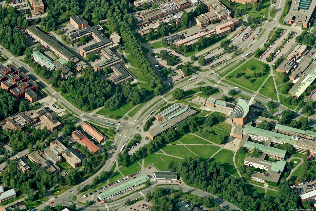
The competition was for design of the new School of Art, Architecture, Design and Media (50,000 sqm), together with the masterplanning of the central square for the largest university campus of Finland, close to Helsinki. The site is surrounded by iconic modernist buidings designed by Alvar Aalto, who originally also masterplanned the campus.

We submitted the entry last week and it was great fun collaborating on this project with the team at Various Architects — with whom we are now sharing an office space in Oslo. The competition is anonymous, so it is not possible to show images of our entry yet, but the shortlisting for phase two of the project should be announced in November 2012.

Portfolio project
Stranded: extreme picknicking in the dunes

Tom Hughes

In response to the Structures on the Edge competition, we collaborated with artist Tristan Hessing, of One Thoresby Street, to explore the ambivalent relationship between art and nature conservation. We designed a shifting public art installation on the wild beaches of the Lincolnshire coast, on the theme of extreme picnicking.

The Stranded art installation, slowly eroding within the shifting sand dunes of the Lincolnshire coast

Our chosen site: a fragile dune ecosystem, isolated on a windblown seashore.

Stranded was our shortlisted entry for the 2010 Structures on the Edge art programme, and a distant cousin of our Bathing Beauties competition entry.

The artists’ brief called for small permanent structures in the sand dunes of the Lincolnshire coast that would respond to the wild beauty and harsh environment. Our response was to design an installation for extreme picnicking as a robust response to the rugged nature of the site.

Shifting sands

We decided to make our intervention at a dune crossing point, reinforcing and protecting the dune whilst giving views and shelter for visitors as they move between land and beach. Stranded would be a faceted concrete structure whose shape was derived from the dune surface, but with points raised to provide views and shelter, and others buried beneath the surface to provide foundations. We would see it as a geometric abstraction of the dune landscape, a frozen snapshot of the shifting sands. It might be taken for an archaeological artefact that has been exposed, or is in the process of being covered, by the sands.

Our collaboration with the artist

We found that Tristan shared our approach to understanding the project and our chosen site at Wolla Bank. We took our cameras and tape recorders and had a picnic in the dunes. We talked and sketched and thought, but we also interviewed everyone we could — hikers, families, fishermen, dog walkers, bird watchers.

It became obvious that it was the remoteness and rawness that they appreciated. All of them had visited Wolla Bank many times, and they all praised its quietness and undeveloped nature. Rather than change the place by inserting an icon that would signal development, we decided we should intervene in a strong but subtle way in the landscape.

The making

The process of making Stranded would be intimately connected to these intentions. Creating a mould from the sand of the dune, we would dig out areas of the structure which would be ultimately submerged beneath the ground, and build up areas that would be raised. Finally, we would spray on fibre reinforced concrete to form the structure. The process would be like building a giant sand castle — a hands-on process through which we would engage the local community and visitors.

The exposed concrete areas would collect sand and be blown clean so that the structure would change over time, a process that we would document and that would help to explain the life, mobility and sensitivity of dunes to the visitor.

" 2hD have been committed to delivering the highest standard possible at every opportunity in our collaboration, which is absolutely how it should be and the reason why it has worked so well for all parties.
From our initial shared exploration of the site, they were very engaged with my responses and ideas, responding quickly with visualisations and practical suggestions for the making process. The principle of our collaboration was to understand where our common ground was and how best to pool resources and create design without compromise."

— Tristan Hessing, collaborating artist


Portfolio project
iHub competition

Thibaut Devulder

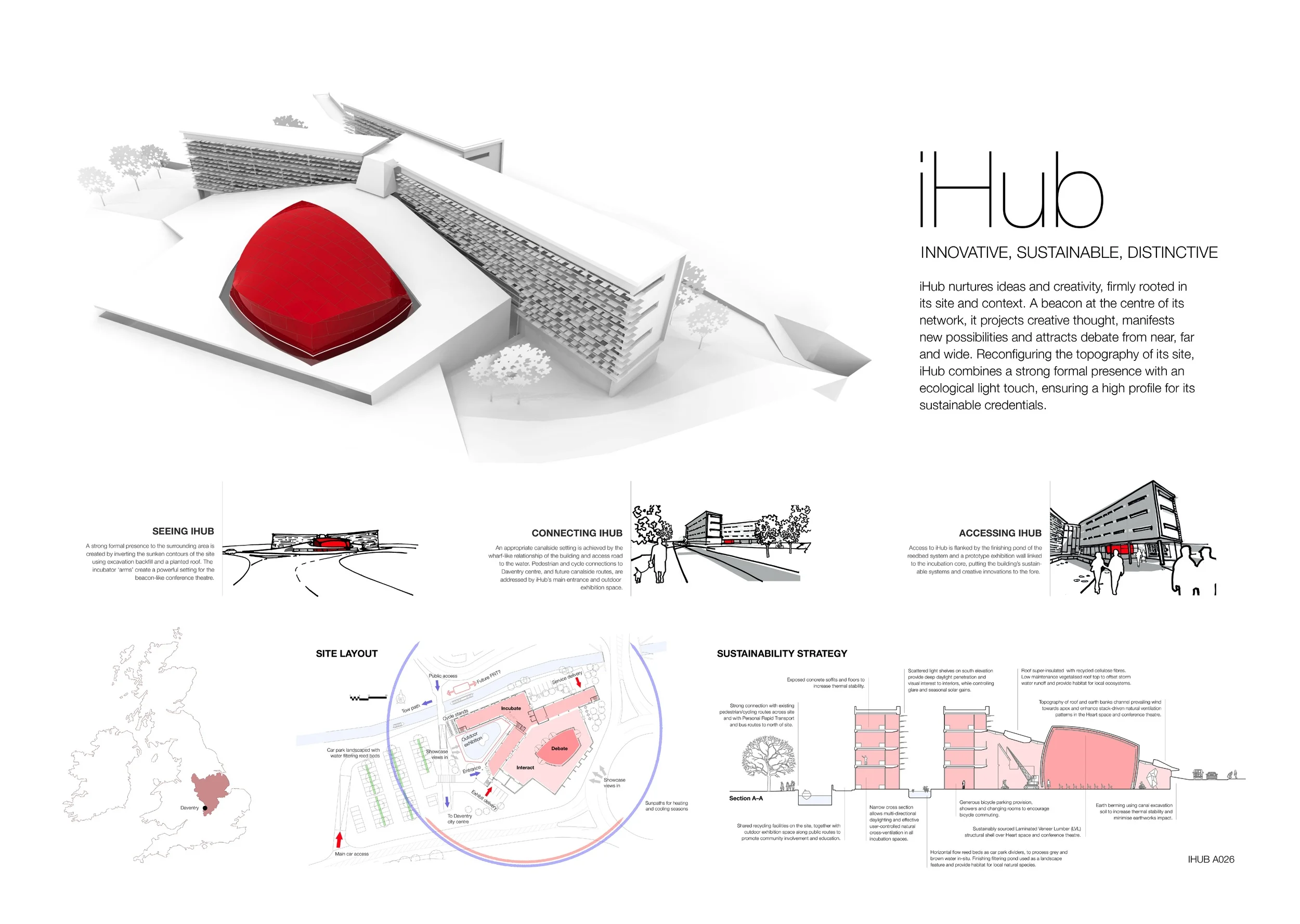
This joint entry project, involving 2hD, Boden Associates and Shared Design, provides a beacon for projecting creative thought through a strong formal and spatial presence, connected with the surrounding canal, road and cycle routes and characterised by a light ecological touch.

The Heart of the iHub: a brightly coloured conference theatre in the social exhibition space

This Building Research Establishment (BRE) competition called for an innovative hub and office building to link centres of excellence in the built environment with entrepreneurial business in order to promote innovative and sustainable technologies. Submitted designs were also encouraged to connect the local town community with the building and its agenda of sustainability and innovation.

The brightly-clad conference theatre pod sits within a highly flexible and dramatically-lit exhibition space, which in turn acts as the activity heart and connective node of the complex. The greened roof above the exhibition hall innovatively reconfigures the site topography providing a new habitat for local ecosystems and driving the natural ventilation inside. 

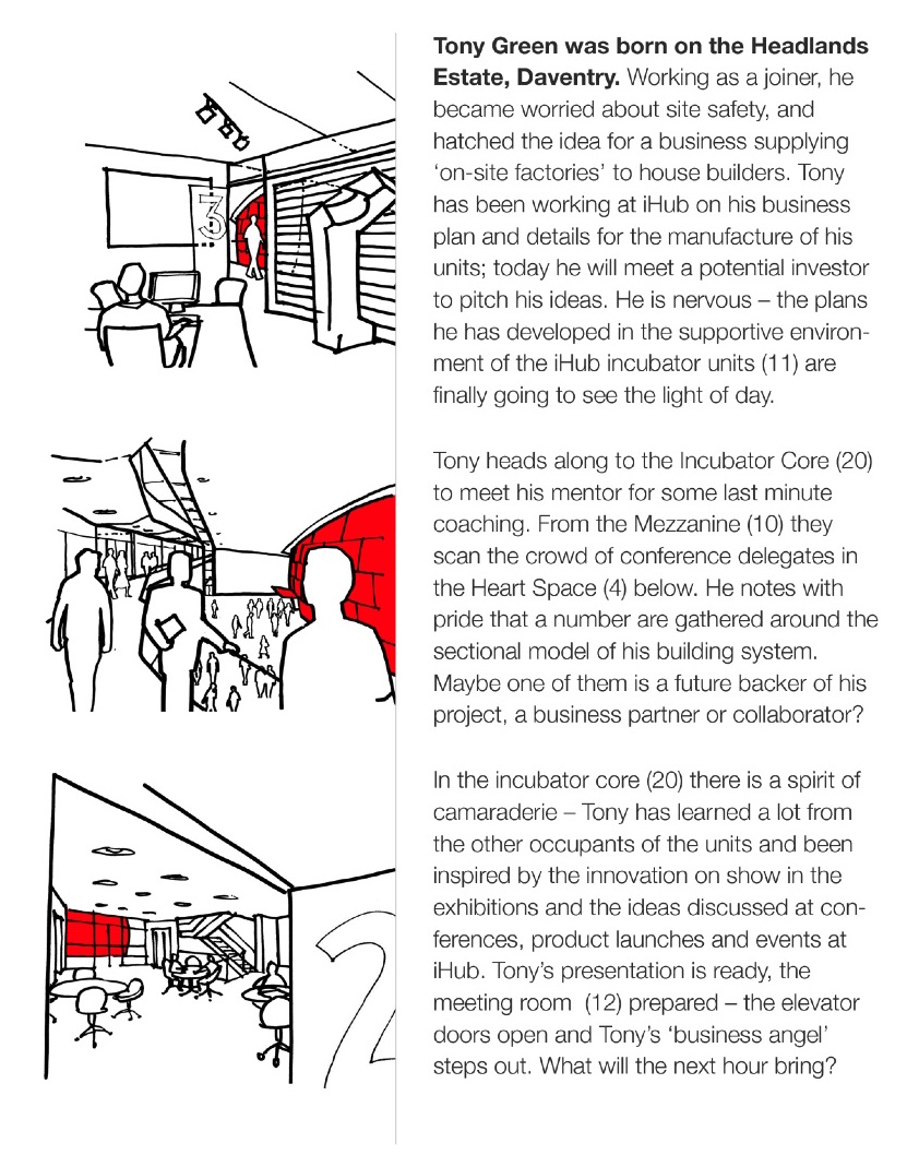
For this competition entry, we extensively used storyboarding techniques to communicate the social dynamics of our proposal. In particular, we presented the way the public would experience the spaces, from the dual perspectives of two fictional characters meeting at iHub: Tony, a resident innovative builder, and Deborah, a potential investor visiting the centre.

Our key achievements in this project:

  • establishing the right level and pattern of connections with the local town
  • distilling the client’s main values needing to be addressed in the project
  • establishing the relational logic of the set of activities to be accommodated
  • determining a fundamental and innovative sustainability strategy
  • marrying sustainability aims with an exciting experience of visiting or working in the building

Portfolio project
Broadway School

Thibaut Devulder

As part of the nationwide programme Building Schools for the Future, 2hD were asked by Lathams Architects to work on the conceptual development of one of the exemplar designs — the renovation and rebuilding of an existing 1960s school to accommodate an additional 300 pupils on a tight inner city site, within a limited £15m budget.

Our consortium later on won the bid for the Building Schools for the Future programme in Birmingham.

We were approached at an early stage of the design process and we focused on: 

  • carrying out key site studies, including access and climatic factors,
  • developing the initial conceptual design,
  • replanning the building and site to accommodate a new flexible teaching model,
  • designing the interiors in response to the tight technical and financial constraints.

We worked closely with other consultants, including fire and structural engineers, landscape designers and education experts to integrate their input to the core of the design approach. 

Our approach: 

  • redesigning the school to ensure a friendly welcome and easy circulation for staff, pupils and the community.
  • Incorporating a deep understanding of the transition in teaching methods to allow this to happen naturally over time.
  • creating pleasant learning environments within the pressures of a tight budget and limited space on site.

We initially developed alternative design concepts exploring the subtle relationship between the school and the surrounding communities.

We initially developed alternative design concepts exploring the subtle relationship between the school and the surrounding communities

We sketched extensive and detailed views of the proposed teaching spaces to communicate design ideas to the client and the other members of the team

The evolution of educational methods was to be embedded into the design and we made sure that all teaching spaces were flexible to allow a smooth transition over time

Portfolio project
A beach hut

Tom Hughes

Netker 10 (pronounced ‘net curtain’) was 2hD’s entry to the Bathing Beauties competition to design a landmark beach hut for the Lincolnshire seaside. The project allowed us to explore our interests in site, identity, materials and prefabrication. Great fun and we even got to play with models!

Our physical model for the Netker 10 beach hut, submitted for the Bathing Beauties competition

Netker 10 is a landmark and hideaway for Lincolnshire. Strikingly different from its neighbours, it celebrates the traditional English seaside holiday.

Netker 10 encourages play – inside and out. Flexible to allow the comings and goings of a beach holiday, the hut also allows people to play with their public profile – be it fun, reserved, chilled or outgoing. True to beach hut history, Netker 10 provides privacy for a decorous seaside sojourn, but takes this further by engaging passers-by in a game of peek-a-boo in which the occupant decides just how much to reveal.

Lower the outer mesh doors to take a snack whilst keeping an eye on the beach, the sunset and the folk strolling by. Raise the outer doors to shade the promenade or welcome visitors. Pivot the inner doors to slip into your swimmers. Shut all doors for lock-down mode, and do what you like in there. Or open it all up and let it all hang out.

The randomly-laced cables allow views out, but catch the eye of passers-by, making it tricky to see in. By rediscovering the net curtain, Netker 10 plays with inside and outside, with seeing and being-seen. It filters the elements, creates patterns with light, controls views and access.

The inner layer of pivoting and sliding doors allows fine-tuning of the connection to the outside, creating the ideal family hide. It also gives flexibility for Netker 10 to become a micro-café: ground floor servery, rooftop mini-terrace. Nested in the elevated platform, breathtaking views of Lincolnshire can be enjoyed.

The diaphanous skin is created with vandal-proof and weather-resistant steel reinforced nylon rope (commonly used in playgrounds), laced over an engineered timber frame with marine ply infill panels. Exterior timber is stained, interior surfaces exposed to create a welcoming and warm space.

Nothing like camping holidays on the site of the competition, on the Lincolnshire coast, to develop our concept and ideas!