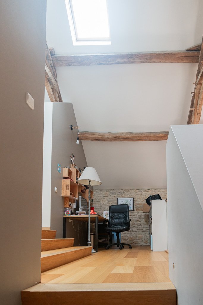
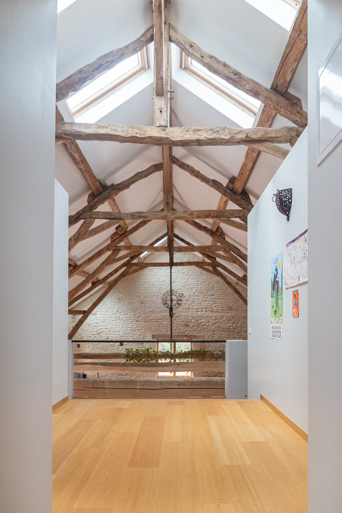
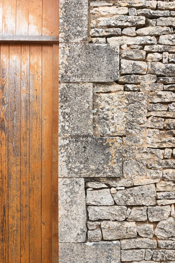
Photos of the converted barn in Gabillou

Thibaut Devulder

I got a chance over the summer to visit the fully converted stone barn that we designed in Gabillou, in south-west France.

This 19th century agricultural building was transformed into a stunning home between 2007 and 2018, by our self-builder clients themselves, who lived in the building over the course of the conversion process, thanks to our phased construction design approach.

With an amazing attention to detail and a lot of enthusiasm, the couple has now become expert self-builders and joiners, already looking forward to a new conversion project to use their skills!

Below is a collection of pictures I took of the finished barn this August. Click on the pictures for a full-screen slideshow!


Dreaming of converting a historical building into your new home?

Samba in the stair

Thibaut Devulder

Following our complete remodel and extension of their cabins in Hvitsten, overlooking the Oslo Fjord, our clients asked us to also fit an extra living space in one of the little annex buildings on the site.

Sections through the proposed tiny annex cabin, showing the “samba” stair to the sleeping space above

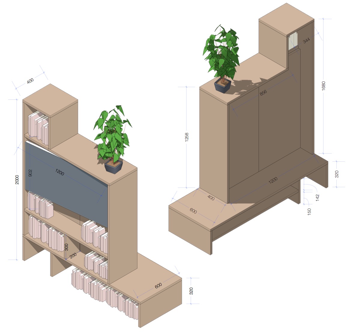
The tiny cabin that we designed accommodates a play space for the children during daytime, a small workstation, sleeping space for two adults and two children, as well as a small terrace for summer breakfast overlooking the fjord. To reach the private sleeping space tucked up over the small living-room, we custom-designed a compact alternating tread stair, called sambatrapp (“samba stair”) in Norwegian, which also doubled as a bookshelves for the desk underneath.

We love working on self-build projects and custom-made furniture, so we were thrilled when our client announced that he wanted to build the stair himself. As with our custom-made screen wall in the main cabin, we developed in collaboration with him alternative designs for the stairs, adjusting the design to joinery techniques he mastered, to produce a full cut-and-assembly manual to build the stairs.

546 brooms: the making of Mission Control

Thibaut Devulder

Crafting our micro-office Mission Control has been a great opportunity for us to experiment with many of the technologies we implement in our larger projects, such as natural materials, prefabrication, breathing construction and self-build techniques.

Let's look back at how Mission Control was actually made.

 
Bringing one of the 13 prefabricated units on site for assembly

Bringing one of the 13 prefabricated units on site for assembly

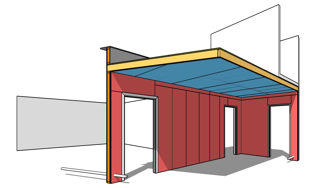
Prefabricating the structure

We wanted to approach the making of our new micro-office as a full-scale architecture project and develop further our expertise in prefabrication and self-build techniques.The structure of the building is composed of 13 timber panels that were prefabricated in our workshop situated 50 meters (and 3 door frames! ) away, before being transported and assembled on the site,

One of the prefabrication manuals: we created one for each timber panel

Each panel was designed so that its size and weight would allow two people (Tom and me) to carry it on site safely. To simplify this, we created a small plugin for SketchUp to automatically check this as we modelled the structural panels, as well as to create detailed material lists and clear fabrication manuals for each module.


Assembling the construction

Once fabricated, each module was connected on site to the existing foundations of the former garden shed and to its neighbouring panels. It was then insulated with natural sheep's wool insulation, which was a real treat to install. The whole assembly was finally wrapped in wood-fibre boards for weather-tightness, extra insulation and breathability.

Section through the breathing wall construction

The interior climate is then simply regulated by natural ventilation (adjustable with vents in the door and skylight) and the heating provided by the waste heat produced by our computers. The whole wall construction is vapour-open, complementing the natural ventilation to maintain a healthy and comfortable environment inside. 


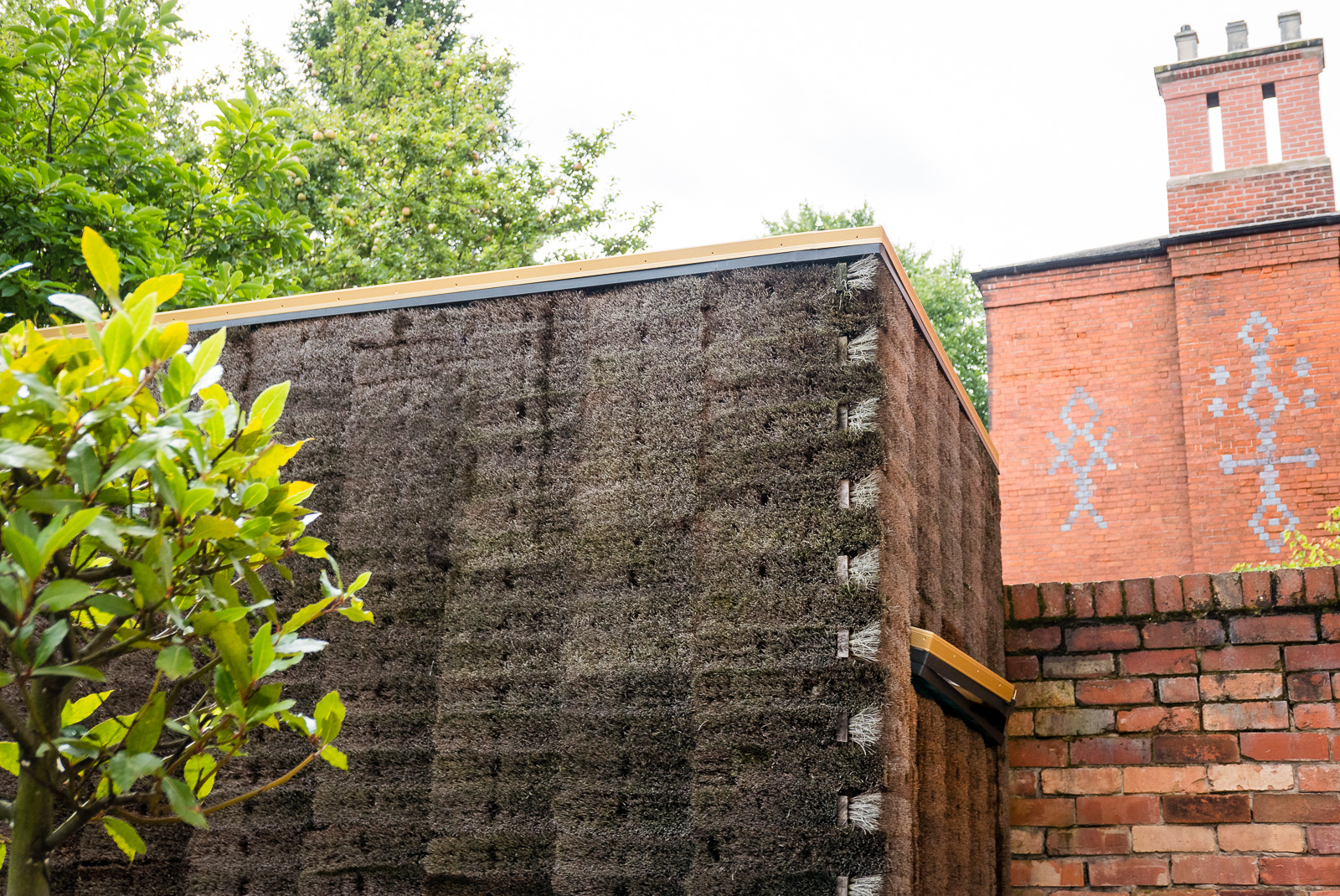
Corner detail of the cladding, showing the interlocked broom heads

The broom cladding

The outside of the enclosure was finally clad with a total of 546 wooden broom heads, with natural coco-fibre bristles, screwed to battens wrapping around the breathing walls.

The selection of broom heads as a cladding material has been the result of a careful search for a material that would fulfil all our needs: a natural material with an interesting texture, readily available and affordable, friendly to the touch, yet resistant to break-ins by concealing any opening into the building.

Broom heads actually proved a rather economical cladding materials, as well as creating beautiful shades of browns and greys that evolve with the seasons and ambient humidity, reminiscent of some traditional thatching techniques.

Imagine, design, build and own...

Designing and crafting our micro-office Mission Control has been a long story: we started toying with the idea almost ten years ago! And it has sometimes been a frustrating one, especially when trying to fit this project between our other "more urgent" projects.

But, in the end, this has been an immensely satisfying project and something we are very proud of — having converted our initial idea into an actual architectural space that we love and truly feel our own, every bit of it designed and crafted with our own hands. A project that embodies many of our ethical values and architectural sensibilities at 2hD Architecture Workshop.

Portfolio project
Mission Control: an experimental hairy micro-office

Tom Hughes

Nicknamed "Mission Control", our broom-clad micro-office is an exercise in teleportation, designed to take us from the everyday hurly burly to a another world — one of calm, quiet and focus. 


The inception of Mission Control

Our UK office was a home office — not squeezed in to a back bedroom but occupying a large ground floor room with direct access to the main entrance and the garden. For some years this served us well, but the arrival of children led inevitably to a loss of separation. As any home-working architect will testify, the room with all the paper and colouring pens is a kid magnet!

To some extent, the injection of informality improved things — collaborations became looser, more relaxed and more creative — but we were left with the need for a ‘cave’ to complement our increasingly lively ‘commons’.

Our working practices have always involved two very distinct modes. The first is highly collaborative and semi-structured, requiring large surfaces, space and materials for analogue production of drawings and models. The second, as a counterpoint, requires periods of immersion in focussed digital design and production work. Our existing home office provided ideal conditions for the former, but creating the conditions for the latter was always extremely difficult.


The new office matches the exact volume and footprint of this old shed

Crafting a solution

In the garden was glazed shed, built by the previous owner from repurposed corrugated iron, old windows, offcuts of vinyl and pieces of timber. Rickety in the extreme, we nevertheless blessed it with the name “Mission Control” because it was a great place to retreat to when setting off fireworks on bonfire night.

We decided the replacement for this shed would become our garden office.


The rise of the garden office has been met by a multitude of packaged solutions, and some truly wonderful bespoke designs. But nothing we could find in the market met our slightly odd needs. 

We also felt the urge to make, at 1:1 scale and with our own hands, something that we had designed from scratch. So we decided to embark on a highly personal journey into design and build.

We designed Mission Control as a sort of antithesis of "the contemplation space with landscape views and flowing inside-outside space". We needed a cell, removed from physical context and worldly distraction, where we could retreat to immerse ourselves in brain work.

Our intention was that the building should create three totally separate experiences: an enigmatic exterior, a serene interior and a ceremonial commute to work...


An inscrutable box in the garden

Without any visible door or window the outer facades are entirely clad in natural coco-fibre broom heads: details and junctions are largely concealed, as the broom bristles interlock to provide a continuous and visually diffuse surface. Thus giving no clue as to its status as occupied or empty, the structure existing merely as an object of intrigue.

This is a reverse Tardis: much smaller on the inside than it appears from the outside. The difference in volumes results from the simple shed-like pitched roof hidden behind the parapet. The polycarbonate surface of the roof only pops through the brush cladding to divert — yet eliminates familiar details like fascias and gutters, which would make the box readable as an archetypal shed or garden office. 

The mysterious object, as seen from our collaborative office space

Corner detail of the coco-fibre broom cladding


One of the two focussed workstation inside Mission Control

A serene enclosure

The space within is a comfortable and calm isolation chamber for undisturbed concentration. Two back-to-back desks are nested under the low ceilings, reminiscent of the containment created by the sloping ceiling of an artist’s garret. 

Interior walls and ceilings are clad with whitewashed plywood, which adds to the calm and natural feeling environment. The breathable walls, wrapped with sheep’s wool insulation, create a healthy internal environment that is easily heated by body warmth and waste heat from computers.

Daylight and ventilation are provided by a single hidden skylight that perforates through the reflective roof surface. 

View into the garden through the open sliding door, clad in brooms


A ceremonial commute

Commuting to work in Mission Control is an important symbolic process: the full experience of ‘going to work’ is here in condensed and enhanced form.

Leaving the house, and travelling the 4 metre journey to the door of the office, provides just enough time to calm and focus. 

Entering the building requires interaction: finding the ‘secret panel’ broom head, sliding back the heavy screen door and pushing through the solid leaf behind...

This is a little ritual that requires concentration and creates distance from whatever else is on your mind. As the door clunks shut behind you, the box seals itself and the separation is complete. Let focus begin.

The boom cladding, momentarily shifted to reveal the space within

How to enter our broom-clad office...

Update: Mission Control has been featured on architecture magazines and websites around the world, including ArchDailydesignboom, TreeHuggerNew AtlasinHabitat and Dwell.


Our self-builder clients share hands-on experience

Thibaut Devulder
Appointing an architect has been one of the most valuable expenses of the project. I guess that it varies with the architecture practice you are working with, but for our project, 2hD have worked perfectly and have created a home totally adapted to our lifestyle and our constraints. Nothing to do with our original basic plans, nothing at all. Everything was taken into accounts: daylight, connections between the spaces, their volumes and their different levels...
Béranger Hau, client and self-builder for our Gabillou barn conversion project

Our client building the new staircase of the converted barn, using massive oak boards sourced from a local sawmill. 

With now ten years of experience as self-builder, transforming a old stone barn in Dordogne (France) into their dream home, our clients Béranger and Mélanie look back at their amazing achievements.

Over these years they have realised virtually all aspects of the building process themselves — from groundworks and water recycling system, to carpentry and furniture making. They have now decided to give back to the self-building community by sharing all their experience in a great article on their project blog (in French), touching on subjects as varied as project planning, finance and tips on how to not hurt your back on a building site...

2hD started to work as architects on this project as soon as Béranger and Mélanie purchased the run-down stone barn, back in 2006. And we have worked hand-in-hand with them ever-since: helping them define a solid project brief, developing sketch design alternatives, selecting adapted and affordable technical solutions, but also creating custom 3D models of the barn to guide them through the self-build construction process.

Amazingly attentive to details and quality, they are now proud owners of a stunning home, as well as experienced carpenters, plumbers, furniture makers and SketchUp 3D modellers! And they even received an award for their work...

Discussing the usefulness of working with architects in self-build projects, this is what our client Béranger has to say:

In the end, even if your project is not as large as ours and does not (legally) require an architect, we strongly advise you to appoint one. You will have all the drawings, and thus a definite vision of what your home can be. And this brings a lot in terms of motivation and anticipation.
Béranger Hau, client and self-builder for our Gabillou barn conversion project

You can read the full article on our client's project blog.

Designing self-build projects for artists

Tom Hughes

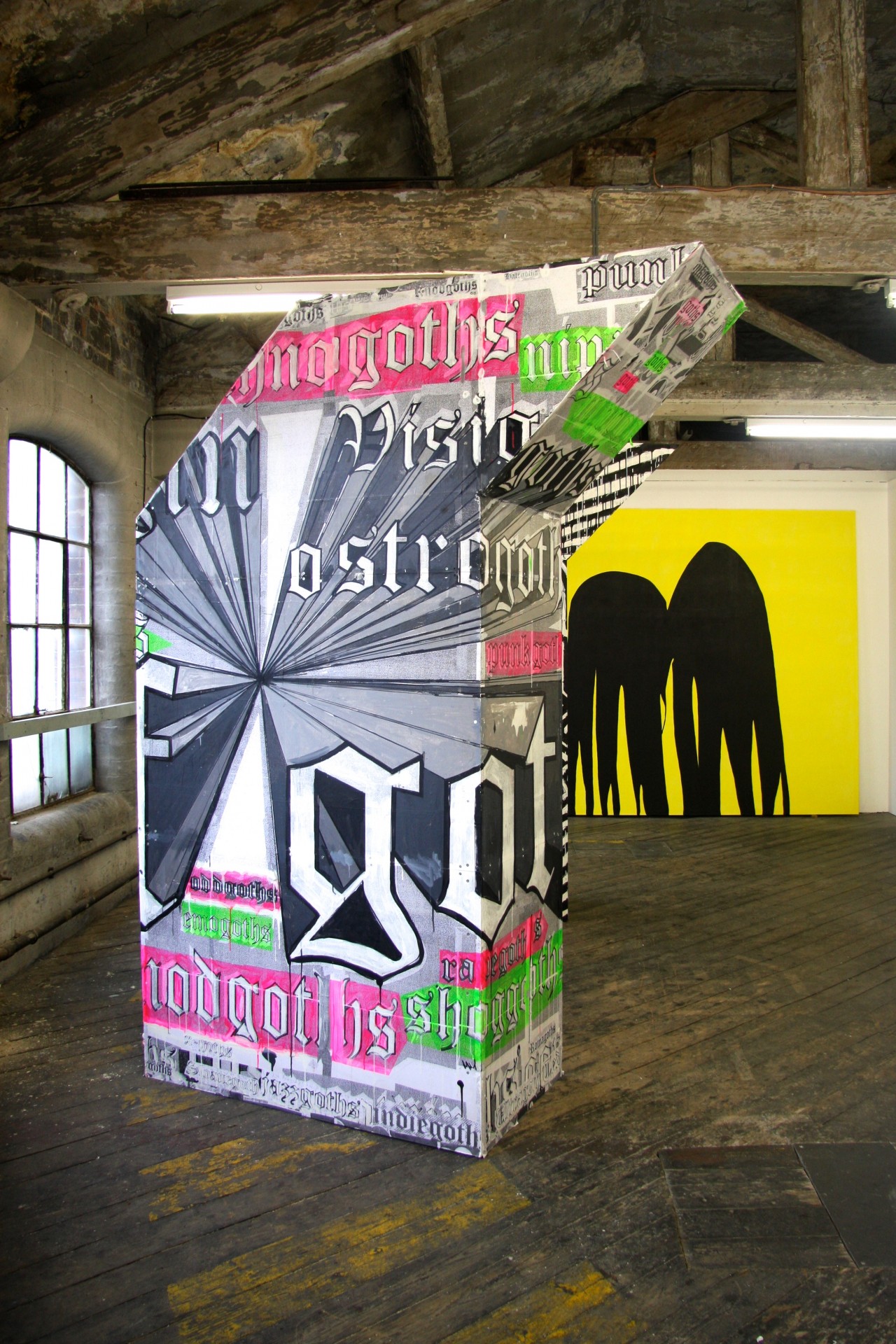
A recent project at One Thoresby Street artists studios and gallery gave us a chance to develop new techniques for designing with self-builders.

Artists at the One Thoresby Street gallery, building our design themselves

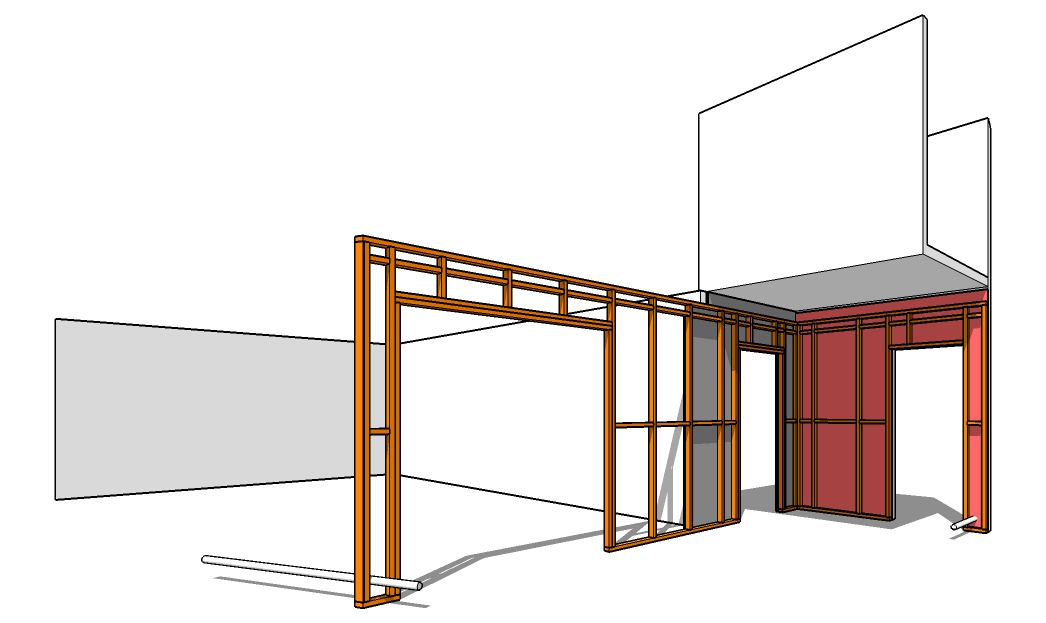
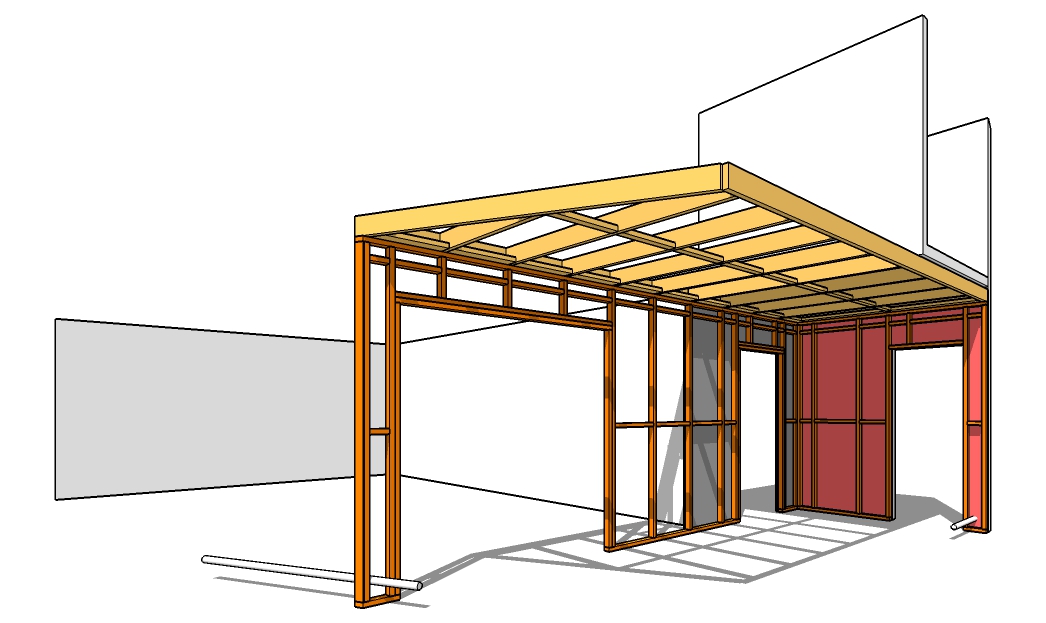
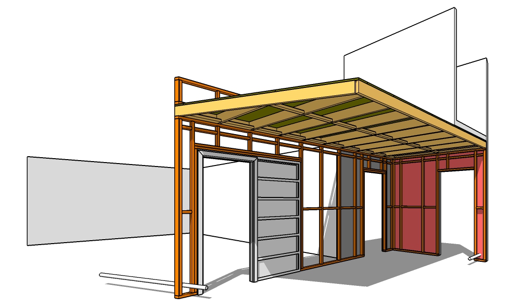
As part of a longstanding relationship with the artists at One Thoresby Street (OTS), we were asked to design a lobby space for the top-floor Attic Gallery. This would sort out circulation between the gallery and studio spaces and provide a vital fire safety feature by separating the occupied space from the access stairwell. Unusually, the lobby would be built entirely by the artists themselves.

We approached the project through a careful survey of the existing building and designed the lobby to create a great experience for visitors as they approached up the stairwell. A sliding fire door, held open on electronic sensors linked to the fire alarm system ensures that movement and views through are eased. The height of the lobby is reduced to contrast with the tall gallery space, which also minimises the materials used and creates a storage and projection deck overhead.

High technical standards had to be met in the project to create a fire resistant construction, the budget was tight for materials and the building team (skilled makers but not construction professionals) needed to have excellent clarity over the build process.

This put huge demands on the communication of technical information, so we took an approach more normally found in larger scale projects - we created a 'Building Information Model'. This was a CAD model showing every structural member, board and component, organised to give the artists a coordinated picture of the materials to order, the dimensions for cutting, the assembly sequence and the spatial relationship between every item in the final assembly. We then lent the group a laptop with the CAD model installed so that they could take the information directly off it on site.

The build proceeded smoothly with a tiny number of requests for additional information, wastage of materials was kept to a minimum and the end result is a happy self build client, an effective adaptation and an safer, better Attic Gallery space at OTS.

Assembly manual for custom-designed furniture

Thibaut Devulder

In the summer cabin we redesigned on the Oslo fjord, we articulated the main living space with an open screen that had to perform many functions: create a light visual separation within the open plan space, provide storage for outdoor clothing and shoes for up to ten guests, integrate a large TV and offer seating in front of the new wood stove.

We finalised the design of this custom-made furniture as the project was already on site and decided to build it out the same oak bench plates used for the new kitchen. We created detailed instructions for the builder about how to make and assemble this large piece of furniture. Our instructions even included the detailed cutting patterns to minimise waste from the standard benchtop boards used to make it!

Cabane

Thibaut Devulder

The structure of woven maple shoots we ended up with...

Playing with my two-year-old son in my dad's garden, we found a bundle of young shoots freshly cut from a pollarded maple tree. Without any particular plan to build anything, we started to stake them into the ground and bend them around randomly. We somehow ended up with a nice little hut...

The overall form of the hut and its weaving patterns simply emerged from the natural flexibility of the bent branches and the shape of our own bodies pushing them around. A refreshing lack of processed materials, tools or planned design. Just an interaction between play and the natural resources of a place. Maybe the way a bird would build its nest?

The branches were simply woven into one another, without any particular plan or pattern

The resulting woven structure was surprisingly strong!

Community inspired architecture

Tom Hughes

I teach with fellow 2hD Director Chris Heuvel at Nottingham Trent University (NTU) and I'm a director of Sneinton Alchemy — a Community Interest Company based in Sneinton, 2hD's local neighbourhood in Nottingham. Sometimes this mix of roles is a bit demanding, but more often than not there's a symbiosis, bringing strength and depth all round.

And so it was with a recently-completed project to design a small community allotment building for the "Growin Spaces" project in Sneinton.

Alchemy has been training a team of Community Organisers over the last few years: dedicated individuals who go out into the community to listen carefully to people on the streets, in pubs, in mosques, churches and homes. They listen to the young and old, to workers, business owners, those in power and the disenfranchised. They build community networks and gradually empower people to take action, follow their dreams and build a stronger community. And it works.

Growin' Spaces

One "proof of the pudding" is the Growin' Spaces project - set up by Stevie Doig. He had an idea about a community allotment which, over time working as a volunteer Community Organiser, he built into a reality. Listening with our team at Alchemy helped him build the mandate he needed to get the wider community on board. This ensured the sustainability of the project and gave him confidence to make broader links and gain important contracts and supply lines.

Now Growin' Spaces has transformed many abandoned allotments into productive growing space, providing work experience and structure for long term unemployed along the way. The project also feeds hundreds of local people each month, using allotment produce and "Fare Share" food wasted by supermarkets.

Low-tech architecture

The success of the project has generated the need for small buildings on site at the allotments. Initially a place to shelter and lock up equipment, this might expand over time to provide a learning space and other facilities. So Stevie asked me, with my 2hD hat on, if I might be able to help him explore design ideas.

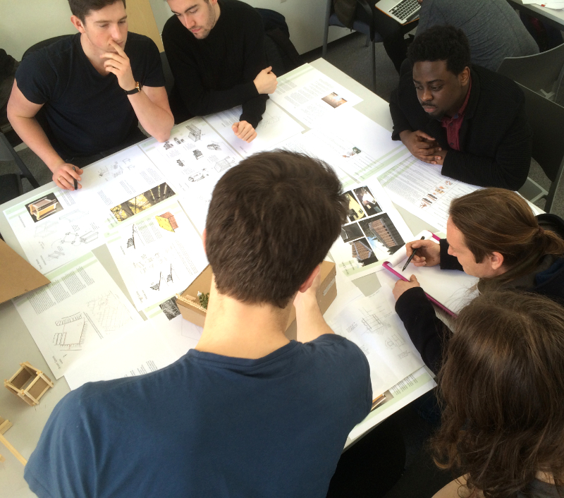
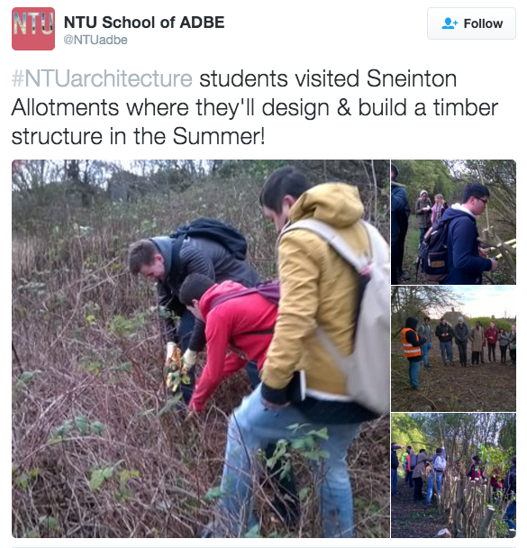
I teamed up with Chris and we identified an opportunity at NTU to create an architecture studio student design project. Chris got the students out on to the allotments, meeting Stevie and his volunteers, and pitching-in with some clearance work. This experience inspired them to create imaginative but buildable designs for a small wooden building using low-tech timber framing. 

Stevie and the Community Organiser team then came to NTU to interview the students and select their favourite designs. These projects were displayed at the "Our Sneinton" public event, with a winner being chosen by popular vote. Over the summer, the building will be built!

Great outcomes, including for NTU meeting a number of the objectives of its new Strategic Plan, including "enriching society", "valuing ideas", "creating opportunity" and "empowering people".

So for 2hD, NTU, Sneinton Alchemy and Growin' Spaces, it´s a win, win, win, win situation.

Community inspired architecture at its finest!

A visit to the self-built barn

Tom Hughes

I was lucky enough to visit Béranger and Mélanie during the summer to see the progress they've made on the barn. It also turned out to be the day after they got married!

 Barn, home, labour of love, wedding venue... 

The exterior of the building, the main space, kitchen and master bedroom are completed with heroic attention to detail, leaving the upstairs bedrooms still to do. After a break in the internal works Béranger and Melanie plan to knuckle down again over the winter to see how much they can finish.

Casting a critical eye from the future study space. 

The existing roof timbers and stone walling are offset by contemporary insertions

The exterior shell retains its barn-like simplicity

You can follow progress on the project via our clients' blog, or check out our previous barn related posts. Congratulations to our clients on their dedication and sheer hard work... Good preparation for married life!  

Au revoir! 

Interior shots of self-build house

Thibaut Devulder

Our client and his family have now moved into their new self-build house on a hillside in Eidsvoll, Norway. Here are some early interior shots of the finished house.

Photo @ Caroline Prøven Brohaug, CABRO Photo

Norwegian self-build house on site

Thibaut Devulder

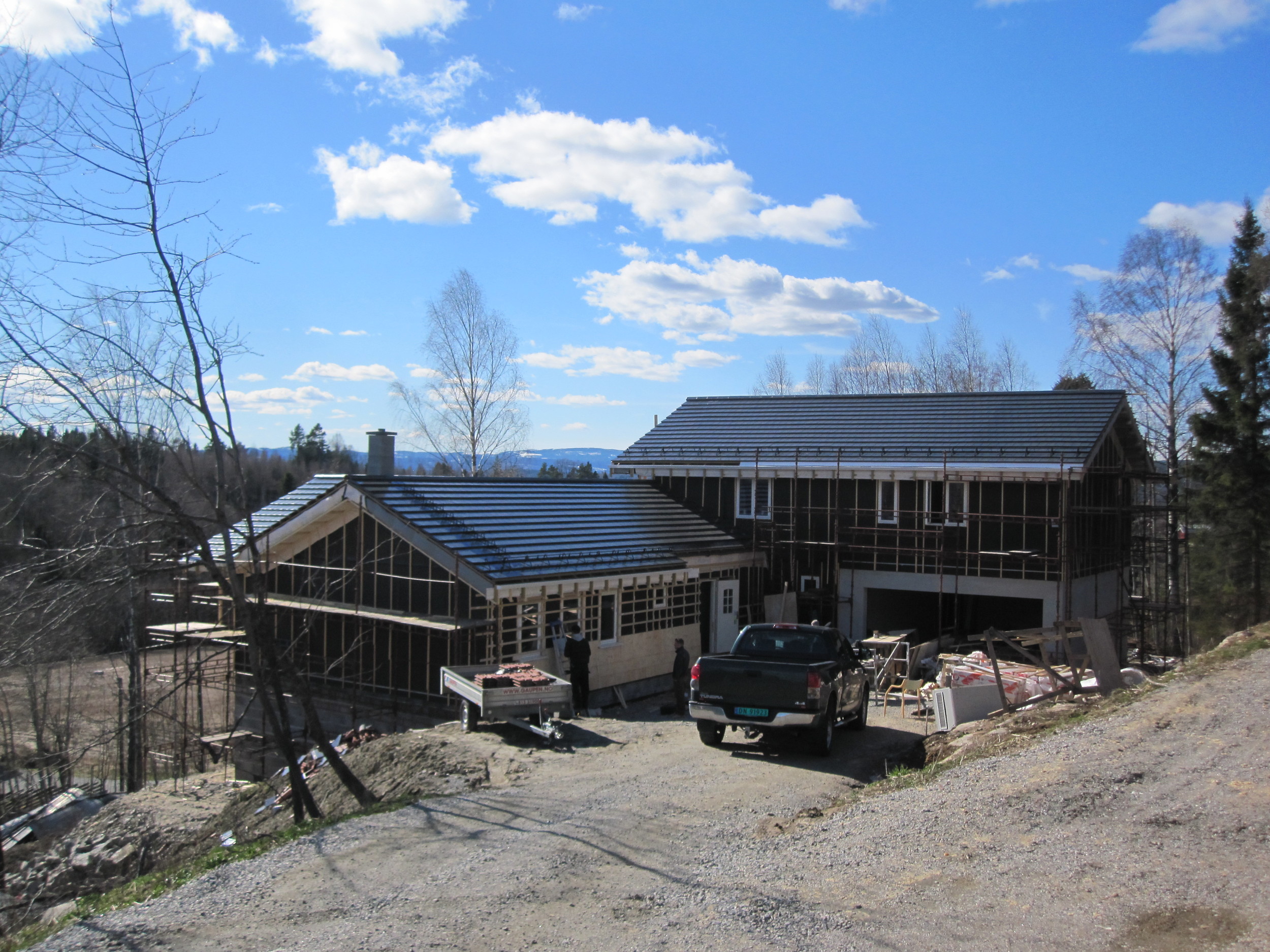
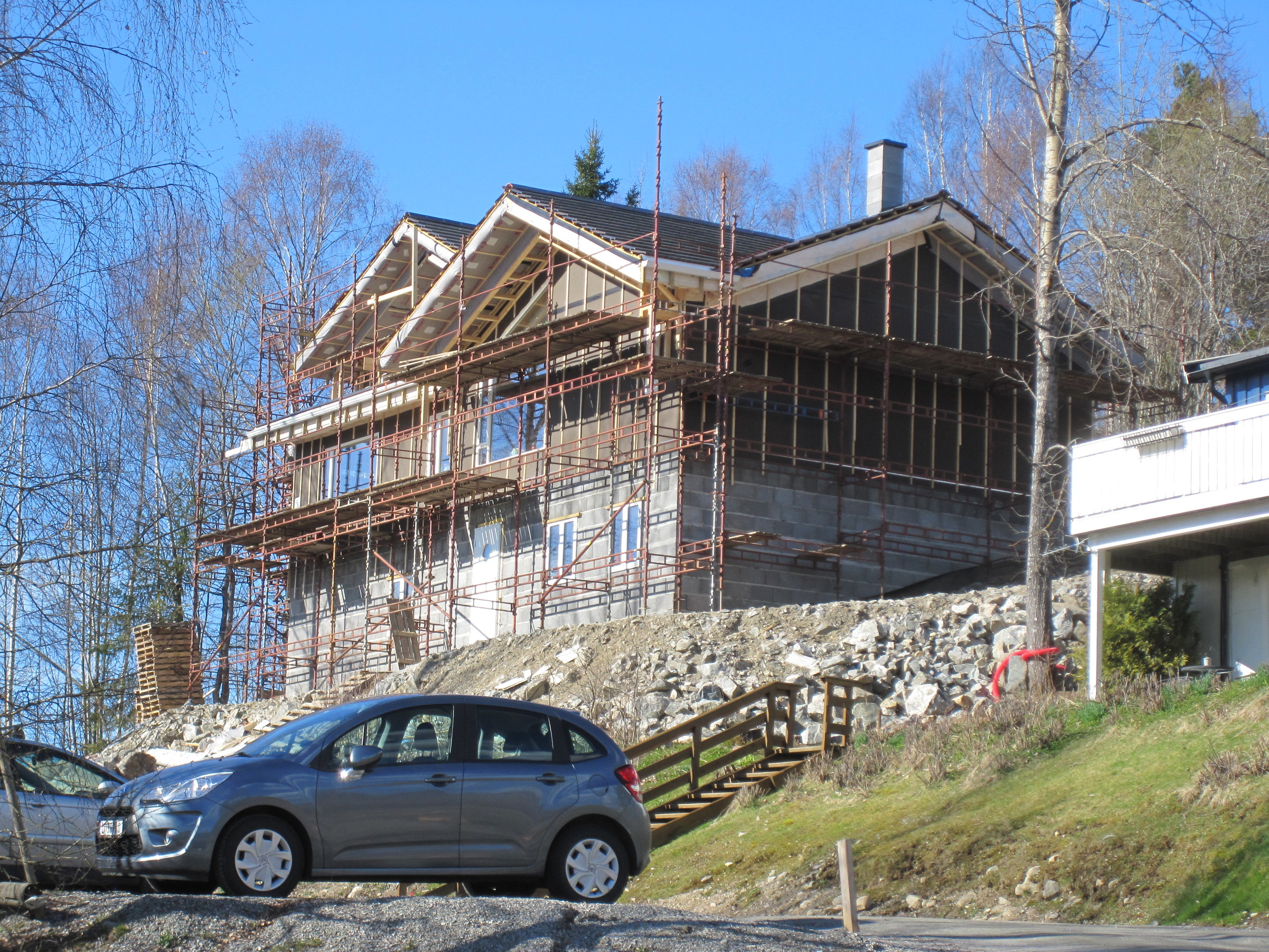
The house in Eidsvoll we designed last year is nearing completion now.

Our self-builder client has been hard at work finishing the house's timber frame (all using pre-cut I-joists), now well insulated with blown-in cellulose insulation.

The cladding of the facades is also underway, using wood shingles made of untreated malmfuru, a species of local pine grown slowly in the Norwegian mountains, which is rich in heart wood and naturally resistant to weather.

The family is planning to move in later this summer.